- Home
-
My Models
-
AV History
- Airline History Blog
-
Airline Development
>
-
Liveries
>
- Aeroméxico Liveries
- Air China Special Liveries
- American Airlines Liveries
- British Airways Liveries
- Continental Airlines Liveries
- Delta Air Lines Liveries
- Eastern Air Lines Liveries
- Landor Liveries
- National Airlines Liveries
- Northeast Airlines Liveries
- Northwest Airlines Liveries
- Pan Am Liveries
- Trans World Airlines Liveries
- United Airlines Liveries
- Western Airlines Liveries
- Airbus A380s >
- Boeing 747 >
- Real Airport Histories >
- Plane Spotting >
- Aviation Stickers >
-
1:400 SCALE
- Collecting 1:400 Scale >
- The History of 1:400 Scale >
-
1:400 Brands
>
- Aeroclassics >
- Airshop Diecast
- AURORA Models
- Aviation400 (2007-2012)
- Big Bird 400 Your Craftsman
- Black Box Models
- Blue Box & Magic Models
- C Models
- Dragon Wings
- El Aviador 400
- Gemini Jets >
- JAL Collection / Jet Hut >
- Jet-X >
- MP4 Models
- NG Models >
- Panda Models >
- Phoenix Models >
- Seattle Models Co (SMA)
- Skyjets400
- Sovereign Models
- TucanoLine
- Witty Wings / Apollo
- Yu ModeLs
- 1:400 Custom Models >
- Production Numbers
- Zinc Rot
-
1:400 Moulds
- The Best Moulds >
- Airbus >
-
Boeing
>
- Boeing B-377 Stratocruiser
- Short Boeing 707s & 720s
- Boeing 707-320/420
- Boeing 717
- Boeing 727-100
- Boeing 727-200
- Boeing 737-100/200
- Boeing 737-300 >
- Boeing 737-400
- Boeing 737-500
- Boeing 737-600
- Boeing 737-700/800/900 >
- Boeing 737 MAX
- Boeing 747-100/200 >
- Boeing 747-400 >
- Boeing 747SP
- Boeing 747-8 Interactive
- Boeing 747LCF Dreamlifter
- Boeing 757-200 >
- Boeing 757-300
- Boeing 767-200
- Boeing 767-300
- Boeing 777-200
- Boeing 777-300
- Boeing 787
- British >
- Douglas >
- Lockheed >
- Other >
- Chinese >
- Soviet >
- Smallest Moulds in 1:400
-
1:400 Reviews
-
Model News
- Model Blog
-
New Mould Samples
>
- Aviation400 >
- JC Wings >
-
NG Models 400 Scale
>
- Airbus A318
- Airbus A319/320 CEO
- Airbus A319/320 NEO
- Airbus A321CEO & NEO
- Airbus A330-200/300
- Airbus A330 Beluga XL
- Airbus A330-800/900
- Airbus A340-200/300
- Airbus A350-900
- Airbus A350-1000
- Boeing 737-600/700/900
- Boeing 737-600 Refresh
- Boeing 737-800
- Boeing 737 MAX-8/MAX-9
- Boeing 737 MAX-7/MAX-10
- Boeing 747-100
- Boeing 747-200
- Boeing 747-400
- Boeing B747SP
- Boeing 747-8I
- Boeing 747-8F
- NG 747s Together
- Boeing 757-300
- Boeing 767-200/300 >
- Boeing 767-400 >
- Boeing 777-200
- Boeing 777-300/300ER
- Boeing 787-8
- Lockheed L-1011 Tristar
- Lockeed Tristar 500
- McDonnell Douglas MD-80
- McDonnell Douglas MD-87
- Tupolev Tu-154
- Tupolev Tu-204/Tu-214/Tu-234
- NG Models 200 Scale >
- Phoenix Models >
- Yu ModeL >
-
1:600 SCALE
- DIORAMAS
|
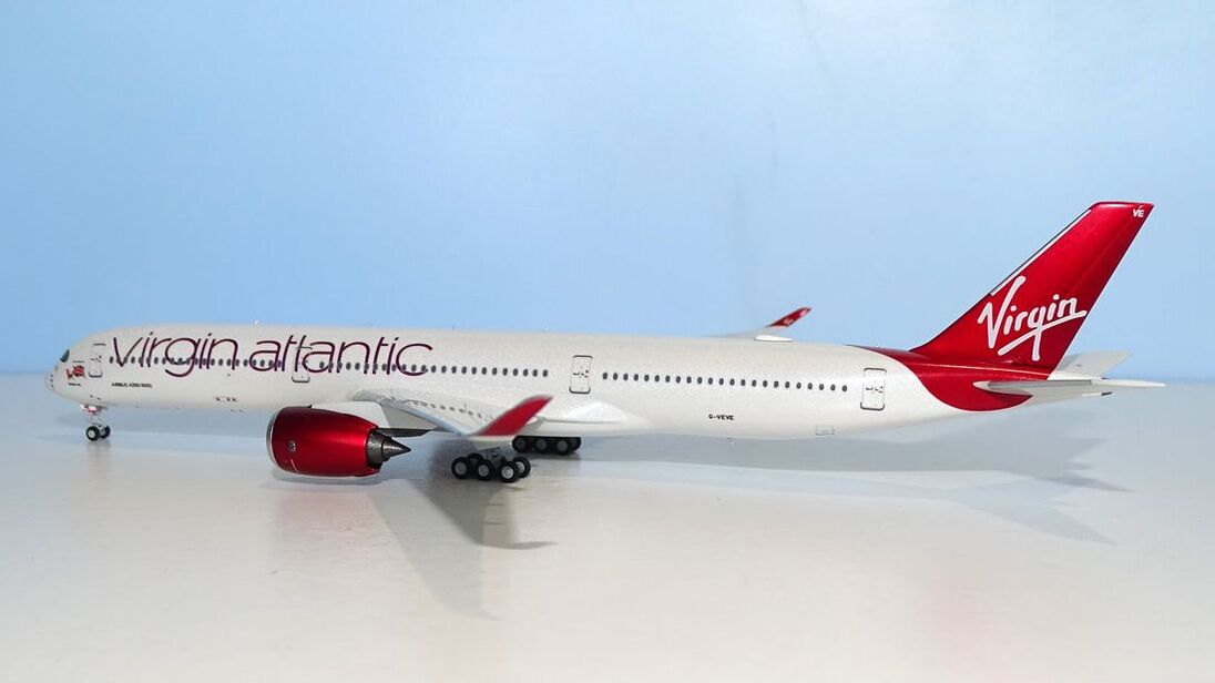
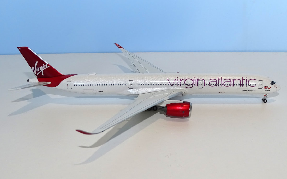
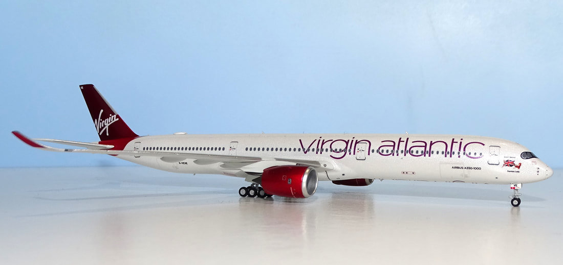
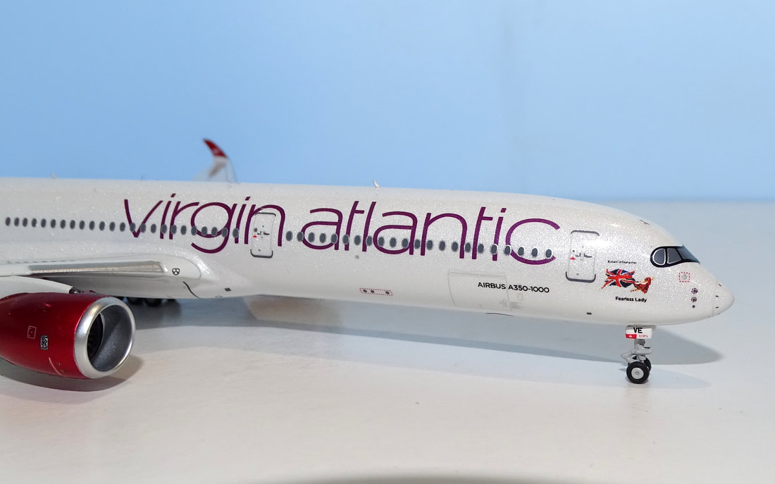
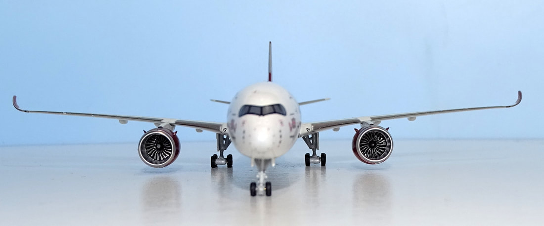
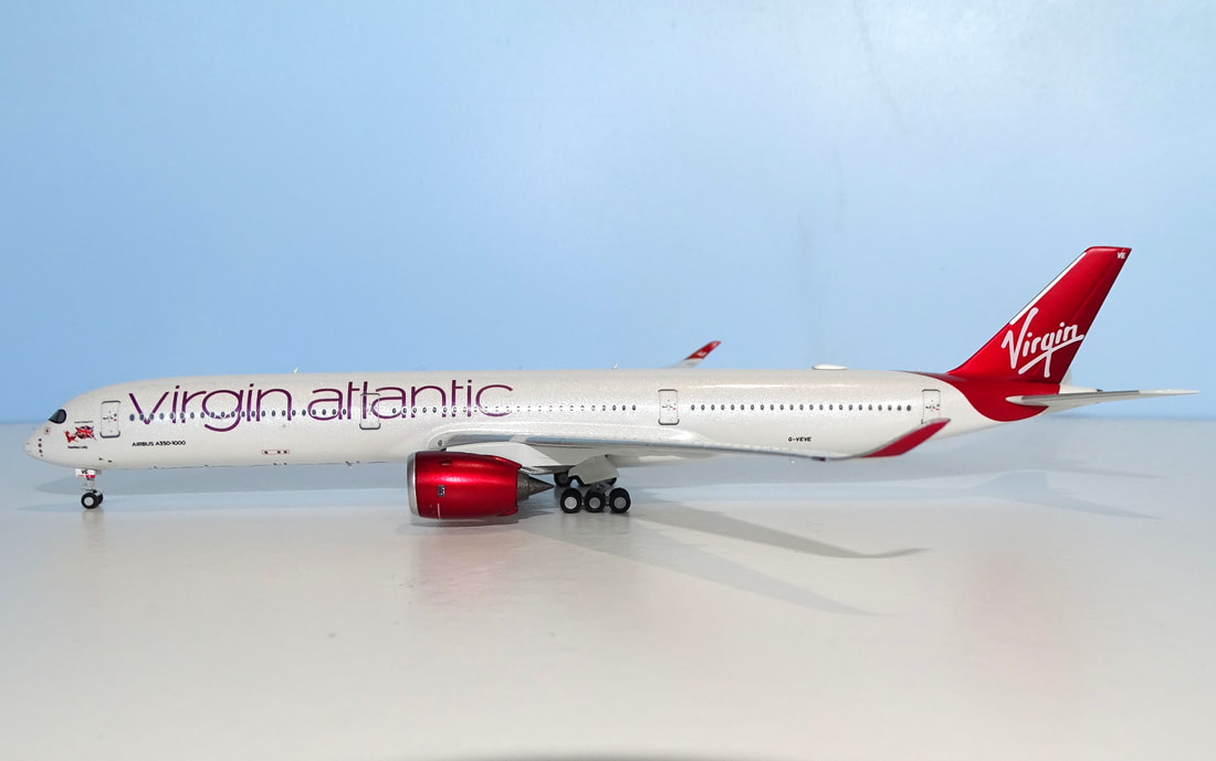
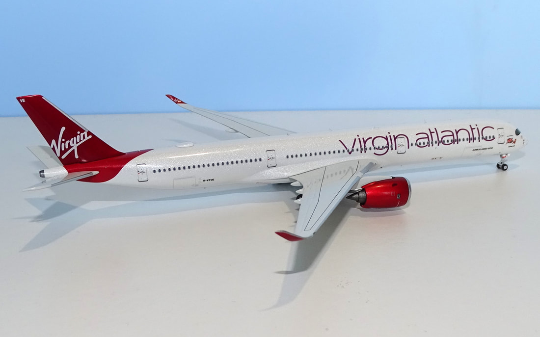
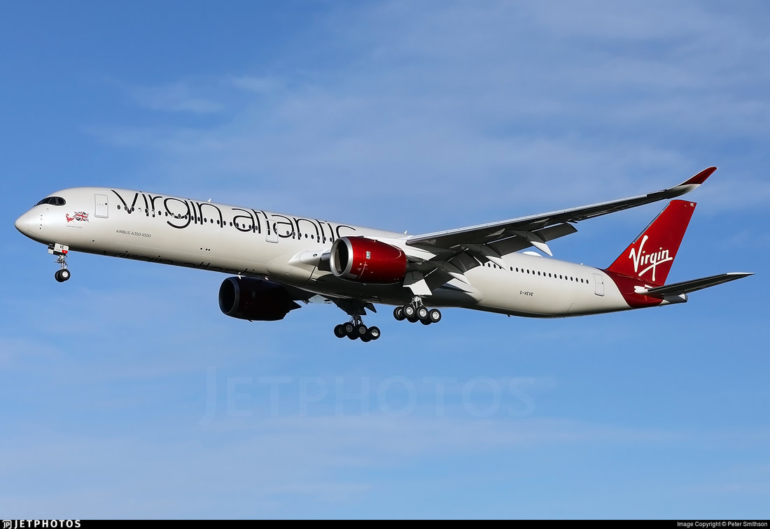
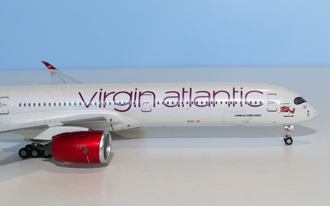
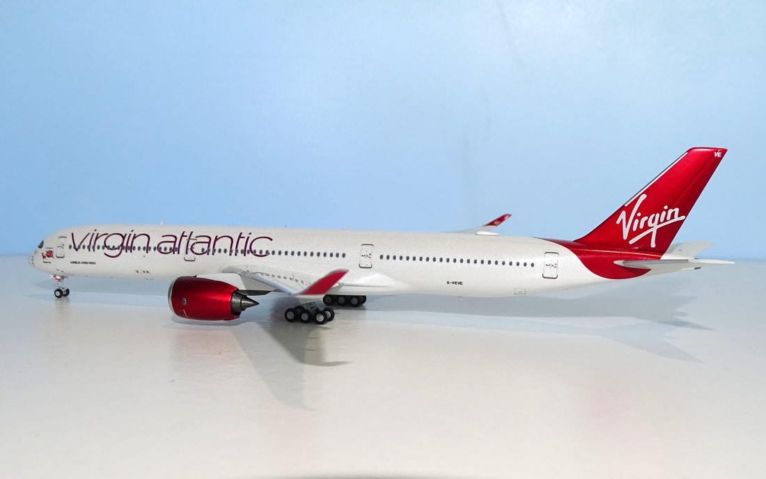
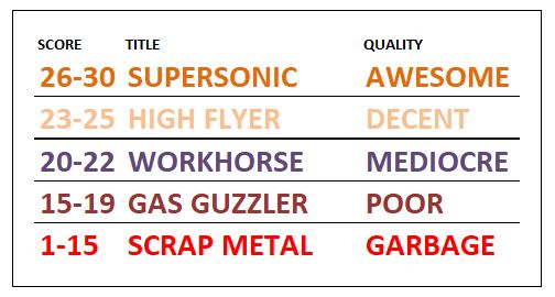
NG Models have been filling out their mould catalogue, plugging gaps in the existing families with the like of the A318 and A350-1000. The A35K debuted with last month's announcements and provides strong competition to the existing three other moulds on the market. Of the two examples released it is the Virgin example that looked the best to me so let's see how this tricky livery performs in a detailed review. FORMAT Each review is to split into three key areas:
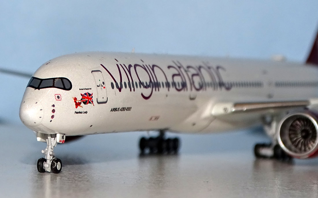
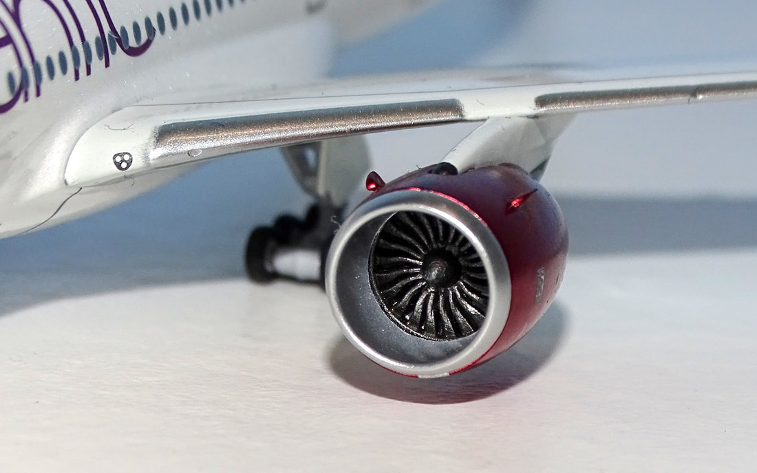
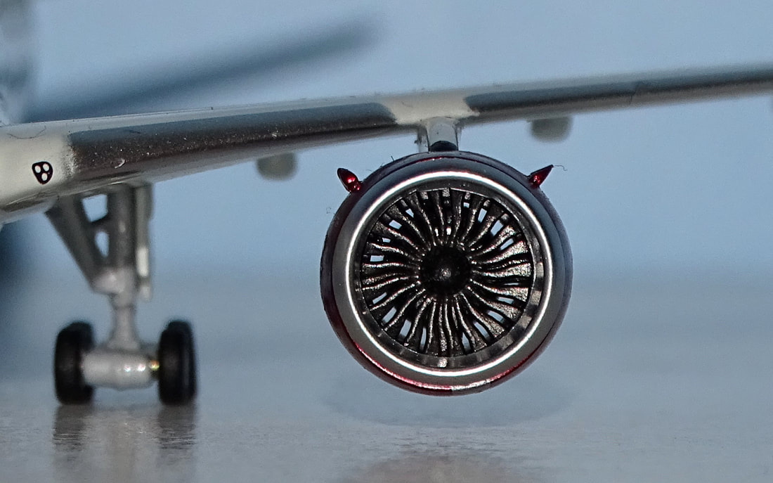
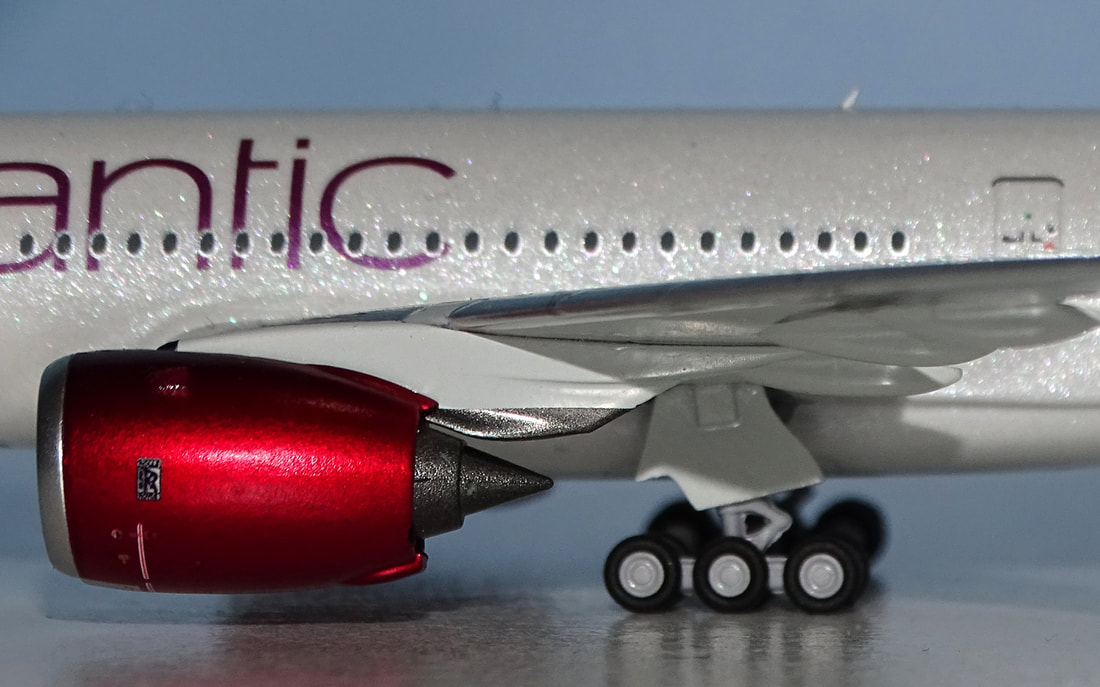
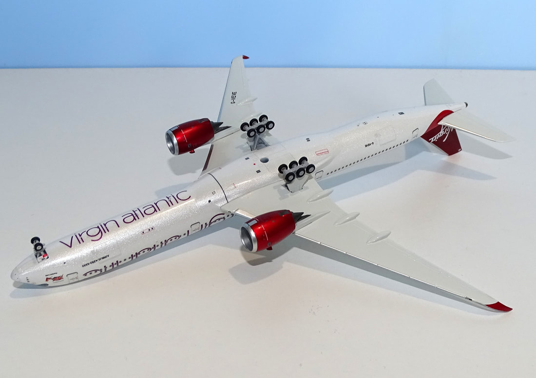
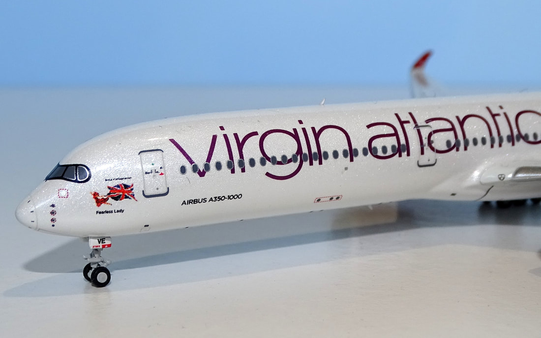
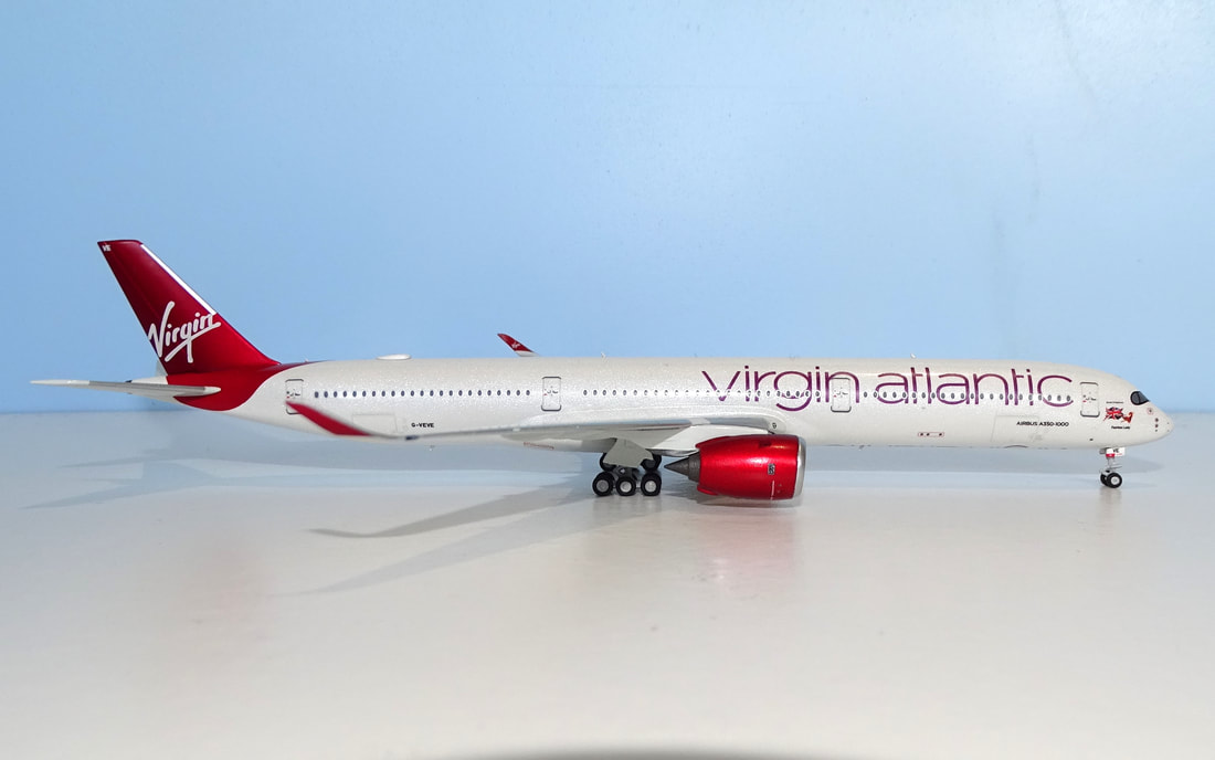
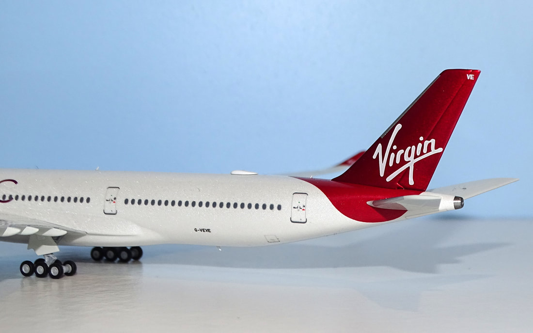
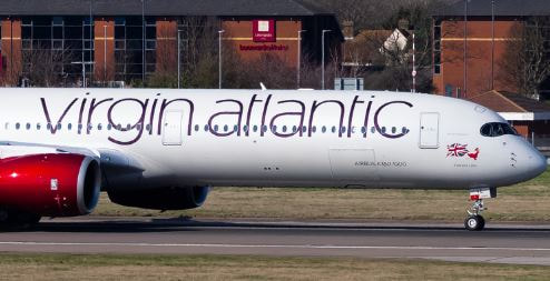
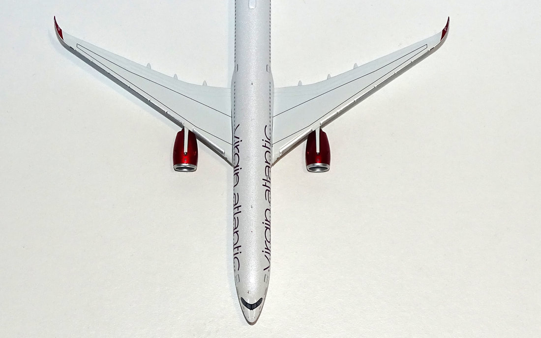
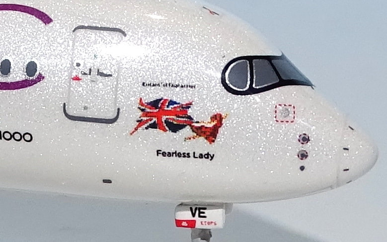
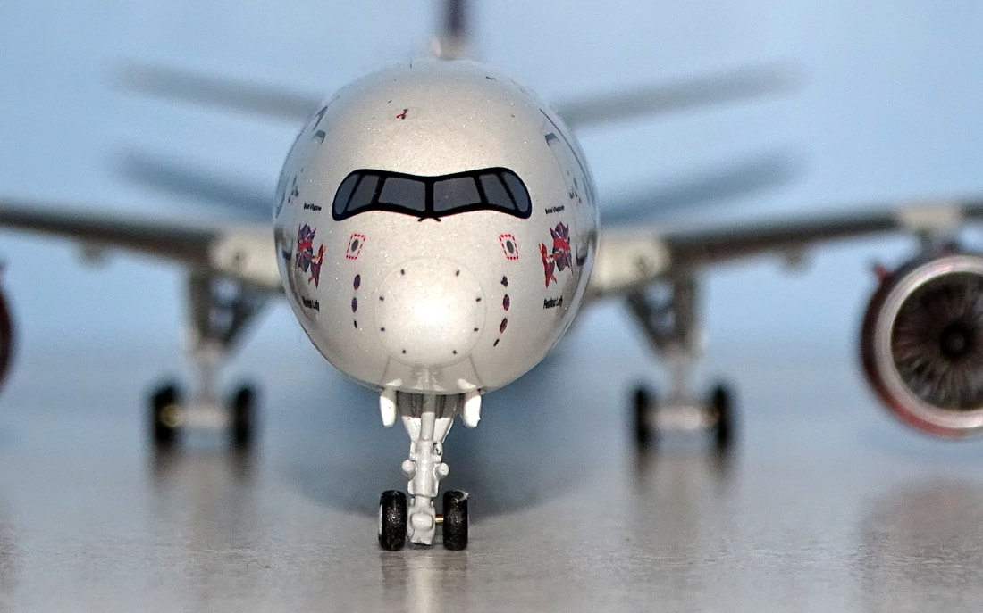
MOULD I reviewed the new sample mould for the A350-1000 from NG Models in July only a month after I had reviewed a recent example of its strongest competitor the Aviation400 mould. For both reviews see: This NG Models version shares the majority of its features with the smaller A350-900 save the fuselage length and maingear. Both the NG Models and Aviation400 are exceptional moulds with great sets of features but both offer a contrast to each other also. Which you end up preferring is up to you and you can't go too far wrong acquiring either to be honest. The cockpit and nosecone region of the A350 is an area of much debate amongst collectors as to who has the best form. Personally I prefer the sharper angle change of the NG version but I know others disagree. The NG mould also has a smaller and better sized nosegear door plus a more finely detailed gearleg. The smaller gear door gives the NG a slightly higher look than the AV400 but it is largely an optical illusion. In most other areas the NG mould is of a similar high quality to the Aviation400, and sometimes slightly superior. For example, although the engines and pylons are comparable the NG has a superior rear underwing engine pylon shape. The engine fanblades are also a better combination of blade and gap than those of the AV400. There are 22 blades compared to 18 on the AV400 mould. This is more realistic and means the gaps between blades aren’t too large. The blades however do not spin as they do on the AV400, but this feature is in my opinion pointless anyway. Aviation400 tends to go for interactive features whereas NG has increasingly decided against these and opted for more realism. This can be seen in the maingear too. The AV400 gear pivots but the NG, in ignoring this, has a slightly cleaner profile. It also has more accurately shaped maingear doors. The fuselage shape, wing join and wing form are all excellent on both moulds. The NG version has a marginally better shaped vertical stabiliser at the front top and a slightly better thicker tailcone. Underneath the AV400 version moulds in the scallop intakes at the wingroot whereas the NG does not. Another area where I think the NG version is better is the aerials. They are slightly smaller than on the AV400 mould and the WIFi also has a better teardrop form. On the minus side obviously only the AV400 mould has the beacon lights. In detail it is surprising how many small differences there are between the two best A350 moulds in 400 scale. For me the NG version has a slightly better overall form at the nose, nosegear, fanblades, maingear, aerials, WIFI dome and vertical stab shape. The AV400 version has more interactive features like beacon lights, spinning fanblades and pivoting maingear. SCORE - 10 PAINT & LIVERY The current Virgin livery was rolled out in mid-2010 and introduced large billboard titles reincorporating the full name, in purple, plus a lighter metallic grey paint for the fuselage. The tailfin gained a new metallic deep red colour. The metallic paints make this a challenging scheme to replicate in 400 scale and a challenging one to compare to real photos where it can look quite different in different lights. I am no expert and also have no competing products to compare colour shades with, however I'm not seeing a lot wrong with the shade of grey being used here. From photos of the AV400 version of the Virgin A35K it appears the NG is less yellow and more grey but it is hard to confirm that without the model in hand. I'll leave it up to others to comment here, but personally I like the colour being used. It certainly glistens in close up but not in the way too sparkly way some Aeroclassics have in the past. NG and AV400 have both gone down the route of using a sparkling finish to try and capture the metallic aspect whereas looking at the Phoenix versions it looks like a more matt finished grey, a quite dark one too. Incidentally if you want to see some of the colour variation seen on this frame in different photos JetPhotos is a good place to start - see G-VEVE Virgin A350 at JetPhotos.net. The dark metallic red also looks good to me and really shines in the light. The purple of the main titles also looks good. All this praise isn't to say there aren't faults though. The most obvious is the height of the main titles (an issue shared with the AV400 version). At their lower margin they are in the right place but they just aren't tall enough. On the right side for example the curve of the n and top of the c should be well above the doors near them but are not. Also the curve of red on the outer winglets is too low in my opinion. I suspect people will argue about the colour on this model but for me that isn't its weakness. Overall, it is a good rendition of a difficult livery but as these things rarely are it is not perfect. SCORE - 8 PRINTING & QUALITY CONTROL Print detail and quality is an area where i think NG Models usually excel and broadly with this model that is the case once again. The printing is crisp and clean with plenty of nice detailing. However, with the shiny metallic style paint of the fuselage I do think that perhaps NG has reached what is possible in this scale. The aircraft is named 'Fearless Lady' after Eve Branson and although the logo is present, and is very small, in magnification it is rather formless, especially at the front. I think this is probably due to the texture of the paint being used for the fuselage. The 'Britain's Flag Carrier' text, seemingly not always worn by this frame but on it in 2022, also suffers rather. I'm not going to be too harsh about this because in 1:1 this is too small to call out and because I think it is a limitation of printing on the paint being used to achieve the metallic finish. Certainly across the rest of the model the printing is grand and despite all the overblown hubbub I see about QC yet again this model arrived in perfect condition. SCORE - 9 CONCLUSION I'm interested to hear what people think about this release. Anyone who thinks the mould is poor needs their head read, but when it comes to colour and the metallic finish I am more open to hearing criticism. In my view NG has done well with what is a difficult scheme (and bear in mind these photos are taken with a flash). The texture of the paint to get the metallic finish has its limitations, but without it I feel the livery would feel flat and inaccurate so I think it is an acceptable compromise and the score illustrates that. FINAL SCORE - 27/30
1 Comment
|
AuthorI'm Richard Stretton an aviation enthusiast and major collector of 400 scale models. On this page I take a detailed look at new releases. This site is free. Please donate to keep it going.
|
- Home
-
My Models
-
AV History
- Airline History Blog
-
Airline Development
>
-
Liveries
>
- Aeroméxico Liveries
- Air China Special Liveries
- American Airlines Liveries
- British Airways Liveries
- Continental Airlines Liveries
- Delta Air Lines Liveries
- Eastern Air Lines Liveries
- Landor Liveries
- National Airlines Liveries
- Northeast Airlines Liveries
- Northwest Airlines Liveries
- Pan Am Liveries
- Trans World Airlines Liveries
- United Airlines Liveries
- Western Airlines Liveries
- Airbus A380s >
- Boeing 747 >
- Real Airport Histories >
- Plane Spotting >
- Aviation Stickers >
-
1:400 SCALE
- Collecting 1:400 Scale >
- The History of 1:400 Scale >
-
1:400 Brands
>
- Aeroclassics >
- Airshop Diecast
- AURORA Models
- Aviation400 (2007-2012)
- Big Bird 400 Your Craftsman
- Black Box Models
- Blue Box & Magic Models
- C Models
- Dragon Wings
- El Aviador 400
- Gemini Jets >
- JAL Collection / Jet Hut >
- Jet-X >
- MP4 Models
- NG Models >
- Panda Models >
- Phoenix Models >
- Seattle Models Co (SMA)
- Skyjets400
- Sovereign Models
- TucanoLine
- Witty Wings / Apollo
- Yu ModeLs
- 1:400 Custom Models >
- Production Numbers
- Zinc Rot
-
1:400 Moulds
- The Best Moulds >
- Airbus >
-
Boeing
>
- Boeing B-377 Stratocruiser
- Short Boeing 707s & 720s
- Boeing 707-320/420
- Boeing 717
- Boeing 727-100
- Boeing 727-200
- Boeing 737-100/200
- Boeing 737-300 >
- Boeing 737-400
- Boeing 737-500
- Boeing 737-600
- Boeing 737-700/800/900 >
- Boeing 737 MAX
- Boeing 747-100/200 >
- Boeing 747-400 >
- Boeing 747SP
- Boeing 747-8 Interactive
- Boeing 747LCF Dreamlifter
- Boeing 757-200 >
- Boeing 757-300
- Boeing 767-200
- Boeing 767-300
- Boeing 777-200
- Boeing 777-300
- Boeing 787
- British >
- Douglas >
- Lockheed >
- Other >
- Chinese >
- Soviet >
- Smallest Moulds in 1:400
-
1:400 Reviews
-
Model News
- Model Blog
-
New Mould Samples
>
- Aviation400 >
- JC Wings >
-
NG Models 400 Scale
>
- Airbus A318
- Airbus A319/320 CEO
- Airbus A319/320 NEO
- Airbus A321CEO & NEO
- Airbus A330-200/300
- Airbus A330 Beluga XL
- Airbus A330-800/900
- Airbus A340-200/300
- Airbus A350-900
- Airbus A350-1000
- Boeing 737-600/700/900
- Boeing 737-600 Refresh
- Boeing 737-800
- Boeing 737 MAX-8/MAX-9
- Boeing 737 MAX-7/MAX-10
- Boeing 747-100
- Boeing 747-200
- Boeing 747-400
- Boeing B747SP
- Boeing 747-8I
- Boeing 747-8F
- NG 747s Together
- Boeing 757-300
- Boeing 767-200/300 >
- Boeing 767-400 >
- Boeing 777-200
- Boeing 777-300/300ER
- Boeing 787-8
- Lockheed L-1011 Tristar
- Lockeed Tristar 500
- McDonnell Douglas MD-80
- McDonnell Douglas MD-87
- Tupolev Tu-154
- Tupolev Tu-204/Tu-214/Tu-234
- NG Models 200 Scale >
- Phoenix Models >
- Yu ModeL >
-
1:600 SCALE
- DIORAMAS

 RSS Feed