United Airlines Liveries
The intention of this page is to describe and show all the United Airlines liveries from 1940 to the present day. Schemes prior to 1940 are not covered.
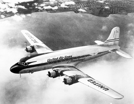
1940s-1947: MASKED MAINLINER 1
The colour scheme of the 1940s was a blue masked cheatline scheme on a natural metal finish. The United shield was carried within wings on the aft fuselage. The red titles stated United Air Lines Mainliner with the Mainliner portion beneath the cheatline aft of the wing. The tail had a simple red, white and blue stripe, although sometimes on the DC-3s it also had a shield and a blue tail front. The Boeing 247s, retired in 1942, had a white base colour.
1947-1958: MASKED MAINLINER 2
It seems the delivery of the first DC-6s (named Mainliner 300s) in early 1947 introduced the first major livery change for United since before the war. A large blue feathered mask wrapped around the cockpit area and down onto the nosecone. It staged backwards into a standard cheatline aft of the wing. The Mainliner aircraft name wrapped around a light blue roundel on the lower nose, within which was the United Airlines shield logo. White United titles were placed within the cheatline forward and on the tail they were reproduced in dark blue above red, white and blue striping. Large UNITED titles were above and below wings.
There were two variants:
There were two variants:
- 1947-1950: Silver fuselage base colour
- 1950-1958: White crowned fuselage top and tail
1957-1963: JET-AGE / TAIL SPEAR
Just prior to the jet-age, at the end of 1957, United introduced a new updated and simplified mainliner scheme. The cheatline was now a simple blue line the same thickness along the entire fuselage. Titles were a black sans serif and slightly slanted UNITED on the fuselage and tail. On the tail they separated a simple red and blue stripe. The shield logo remained on the lower nose and the silver belly was separated from the white fuselage by a thin gold stripe. The United shield logo was repeated ahead of the titles and separated from them by a diagonal line. The scheme was worn by the DC-6s, DC-7s, first DC-8s, B720s, Caravelles, Viscounts and even some early 727-100s. The DC-4s were retired prior to its implementation.
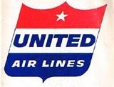
For some reason the remaining Convair CV-340s never seem to have this livery although they were apparently repainted in 1964 with a lighter blue cheatline and did get the new shield crest below.
There were two versions:
For some reason the remaining Convair CV-340s never seem to have this livery although they were apparently repainted in 1964 with a lighter blue cheatline and did get the new shield crest below.
There were two versions:
- 1957-1960: UNITED titles fit inside the shield width
- 1961-1963: New shield logo with UNITED titles wider than the shield
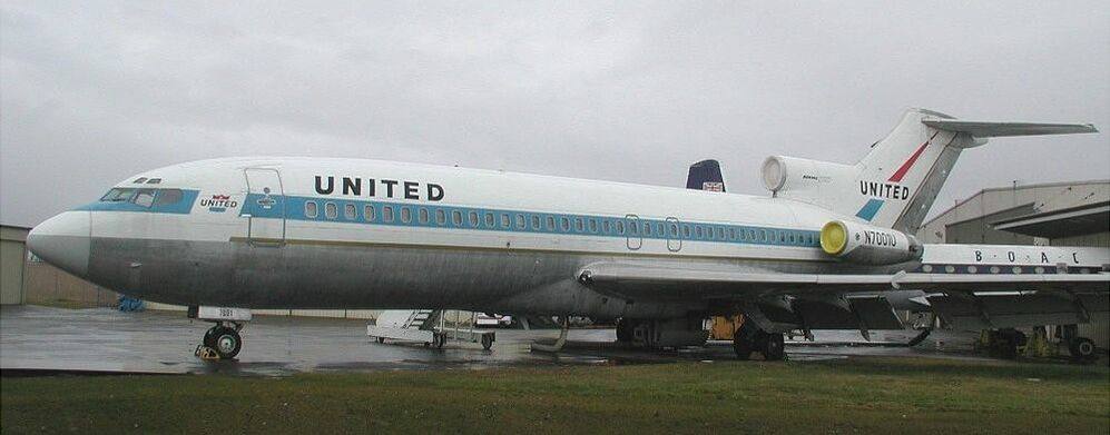
1963-1964: 727 DELIVERY
The first 727-22s introduced a variation to the first jet-age colours. The sweep of White on the nose was replaced by a straight line, the nose logo was removed and the "Shield" was moved from in front of the main titles, to a 'break' in the window stripe. The Gold stripe now ended at the 'break'. The "United" titles were now straight instead of slanted.The sweep of White on the nose was replaced by a straight line, the nose logo was removed and the "Shield" was moved from in front of the main titles, to a 'break' in the window stripe. The Gold stripe now ended at the 'break'. The "United" titles were now straight instead of slanted. The rudders of the 727s remained unpainted.
This scheme appears to have been worn by only the first 20 or so 727s. There were additional minor changes to compensate for the soot issues caused by the smoky engines. I recommend this page for further details:
This scheme appears to have been worn by only the first 20 or so 727s. There were additional minor changes to compensate for the soot issues caused by the smoky engines. I recommend this page for further details:
1964-1969: JET-AGE LIGHTER BLUE
In late 1964 United switched the blue colour to a lighter tone and reverted to a scheme which was similar to the original jet-age colours but with the titles more widely spaced. Initially aircraft seem to have kept the shield logo ahead of the titles but this was quickly lost (leaving only the shield on the nose). The loss of the shield allowed the main titles to be moved forward. As the soot issues on the 727s were recognised their engines were left natural metal, as was an area on the rear fuselage.
This livery was worn by the 720s, 727-023s and DC-8s as well as the first 727-222s, 737-222s and DC-8-61s.
Again there were two versions:
This livery was worn by the 720s, 727-023s and DC-8s as well as the first 727-222s, 737-222s and DC-8-61s.
Again there were two versions:
- Earlier: with the shield on the nose
- Later: without the shield on the nose
1969-1972: LOWERCASE SERIF TITLE JET-AGE
|
In about June 1969 United introduced a new title style with lower case letters and serifs. In addition the shield at the nose was now gone for good and the thin gold stripe separating the natural metal belly from the white was switched from gold to a thicker red. The livery variants get quite confusing at this point as aircraft can be found with differing combinations of title styles and belly stripe (see the DC-8 in the images below with old titles but red stripe).
This livery was introduced on the 747s and worn also by the DC-10s when they entered service. Initially the first DC-10s had no titles on the no 2 engine but they subsequently gained DC 10 Friend Ship titles. Livery was also worn by the 720s, 727s, 737s and DC-8s. |
1972-1974: FOUR STAR FRIEND SHIP
United had used the 'Fly the friendly skies of United' slogan since 1967 and by 1972 this had progressed to 'Our Friendly Times' and Friendships. The last gasp of the old jet-age colours was the four star friend ship with 'Friend Ship' titles and four stars on the fuselage and tail. The lower red stripe was also substantially thickened.
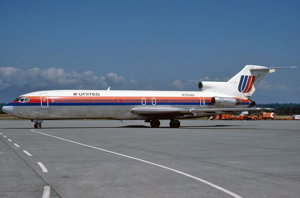
1974-1988: RAINBOW / DOUBLE U / SAUL BASS TULIP
Possibly the quintessential United colours, the Saul Bass designed scheme introduced the Double U 'tulip' logo on the tail. The colours chosen where a patriotic red and blue (a natural progression from the mainliner era) with the addition of a bright orange creating an orange/red/blue cheatline passing through the windowline. Small UNITED titles were carried in black with the tulip logo by the titles and on the tail. Beneath the cheatline the fuselage was white with a low silver belly almost invisible from the side.
1981-84: SILVER BELLY SAUL BASS TULIP
In the early 1980s (photos exist from late 1981 to mid-1984) a small portion of the fleet was repainted with no white under the cheatlines and a complete natural metal belly finish. I have seen photos of this livery variant on Boeing 727-100s, 727-200s, 737-200s, DC-8-61/71s and DC-10-10s. Several of the earliest Boeing 767-200s were initially painted in this scheme variant on the Boeing flightline prior to delivery. They were all repainted into the standard scheme before service entry. I suspect that this was a weight and fuel saving experiment but the finish wasn't great and unsurprisingly it wasn't continued.
Aircraft that wore this short-lived variant include (there are probably others):
B727-100: N7064U, N7065U
B727-200s: N7257U, N7624U, N7634U, N7635U,
B737-200s: N9015U, N9022U, N9038U, N9054U
DC-8-61/71s: N8070U, N8071U, N8085U,
DC-10-10: N1805U, N1811U,
B727-100: N7064U, N7065U
B727-200s: N7257U, N7624U, N7634U, N7635U,
B737-200s: N9015U, N9022U, N9038U, N9054U
DC-8-61/71s: N8070U, N8071U, N8085U,
DC-10-10: N1805U, N1811U,
1988-1993: LOW STRIPE SAUL BASS RAINBOW
This version of the Saul Bass colours lowered the cheatline to accommodate much larger UNITED titles. It suited the new Boeing 737-300s, 757s and 747-400s well but in my opinion looked less impressive on the older 727s and DC-10s.
1993-2004: BATTLESHIP GREY
For the mid-90s United chose a more business-like livery. It featured a silver-grey upper fuselage and striped mid and dark-blue tail with a much reduced tulip logo. Thin triple pinstripes of orange, red and blue separated the upper fuselage from a deep midnight blue belly. The titles read United Airlines for the first time. This scheme came to be known as battleship grey and did have a tendency to fade rather badly. Towards the end of the 90s the Star Alliance logo was added.
As you can see below model manufacturers struggle to get the grey colour correct!
As you can see below model manufacturers struggle to get the grey colour correct!
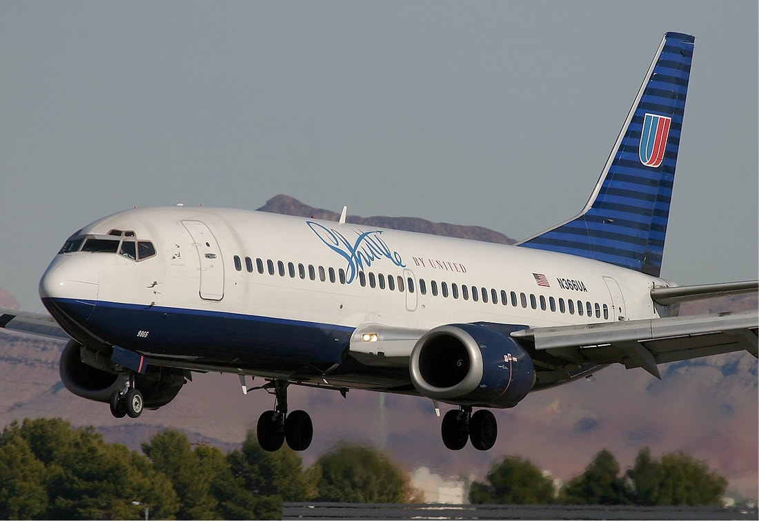
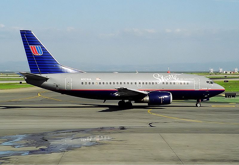
1994-2001: SHUTTLE BY UNITED
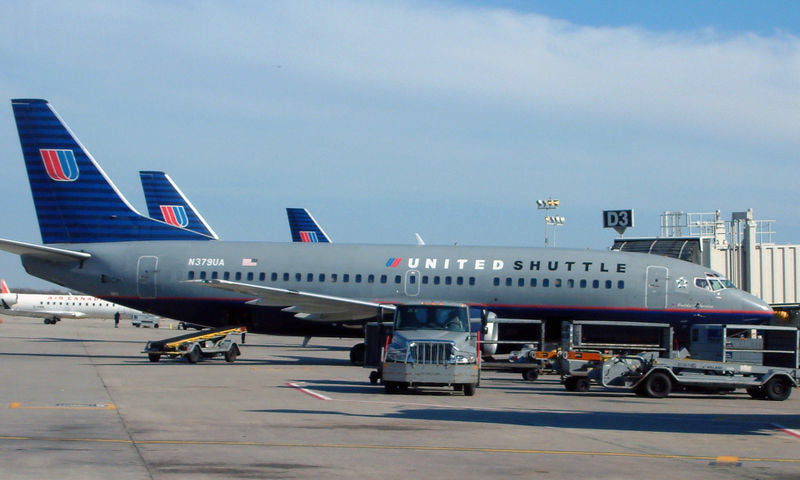
United's West Coast shuttle operation wore several scheme variants during its lifetime. In its latter days it was renamed United Shuttle.
2004-2010: RISING BLUE
2004 brought a departure from the rather staid battleship colours and introduced a new shade of blue as the main tone. The tulip was enlarged massively on the tail and a new font chosen for the UNITED titles.
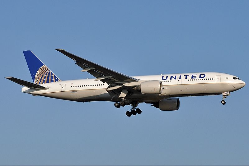
2010-2019: UNICON
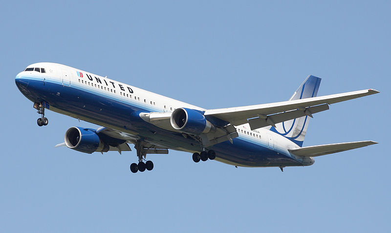
The merger with Continental rather disappointingly brought the end of the tulip, which was replaced with the Continental colours as the new main livery albeit with United titles.
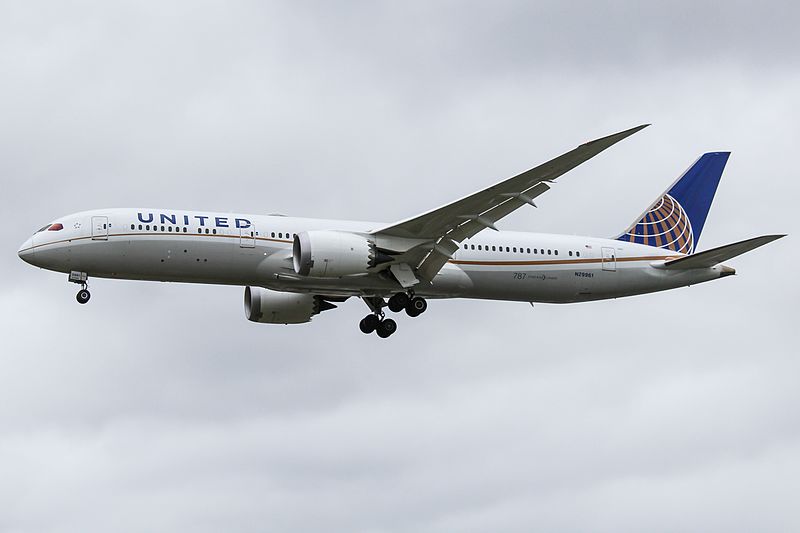
Newly delivered Boeing 787s and 737 MAXes wore a modified version with a wavy fuselage line:
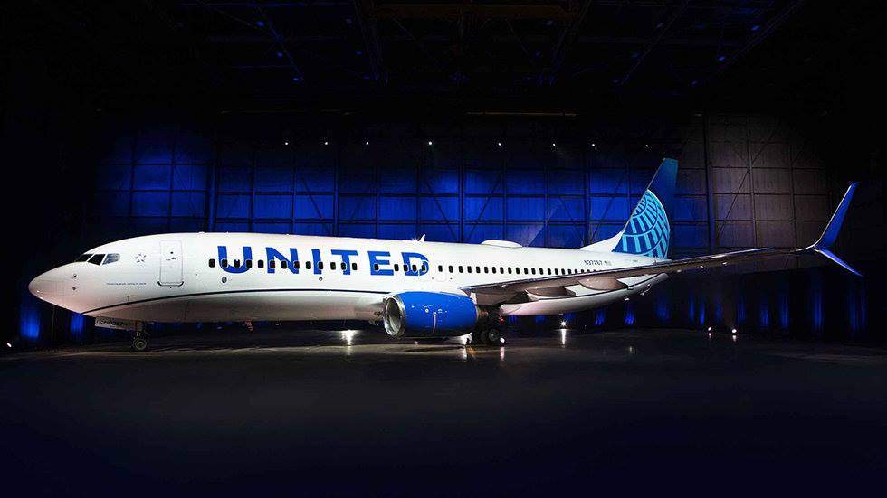
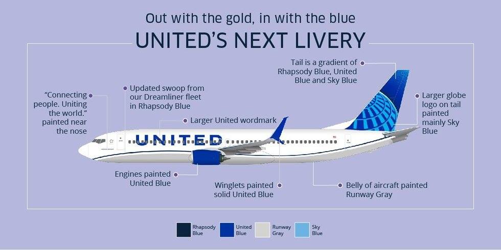
2019-Present: UNITED BLUE
Late April 2019 brought the first leaked look at the new United scheme. It's still too Continental for me but does move back towards the United blue. As the United CEO said it's an 'evolution not a revolution'.

