- Home
-
My Models
-
AV History
- Airline History Blog
-
Airline Development
>
-
Liveries
>
- Aeroméxico Liveries
- Air China Special Liveries
- American Airlines Liveries
- British Airways Liveries
- Continental Airlines Liveries
- Delta Air Lines Liveries
- Eastern Air Lines Liveries
- Landor Liveries
- National Airlines Liveries
- Northeast Airlines Liveries
- Northwest Airlines Liveries
- Pan Am Liveries
- Trans World Airlines Liveries
- United Airlines Liveries
- Western Airlines Liveries
- Airbus A380s >
- Boeing 747 >
- Real Airport Histories >
- Plane Spotting >
- Aviation Stickers >
-
1:400 SCALE
- Collecting 1:400 Scale >
- The History of 1:400 Scale >
-
1:400 Brands
>
- Aeroclassics >
- Airshop Diecast
- AURORA Models
- Aviation400 (2007-2012)
- Big Bird 400 Your Craftsman
- Black Box Models
- Blue Box & Magic Models
- C Models
- Dragon Wings
- El Aviador 400
- Gemini Jets >
- JAL Collection / Jet Hut >
- Jet-X >
- MP4 Models
- NG Models >
- Panda Models >
- Phoenix Models >
- Seattle Models Co (SMA)
- Skyjets400
- Sovereign Models
- TucanoLine
- Witty Wings / Apollo
- Yu ModeLs
- 1:400 Custom Models >
- Production Numbers
- Zinc Rot
-
1:400 Moulds
- The Best Moulds >
- Airbus >
-
Boeing
>
- Boeing B-377 Stratocruiser
- Short Boeing 707s & 720s
- Boeing 707-320/420
- Boeing 717
- Boeing 727-100
- Boeing 727-200
- Boeing 737-100/200
- Boeing 737-300 >
- Boeing 737-400
- Boeing 737-500
- Boeing 737-600
- Boeing 737-700/800/900 >
- Boeing 737 MAX
- Boeing 747-100/200 >
- Boeing 747-400 >
- Boeing 747SP
- Boeing 747-8 Interactive
- Boeing 747LCF Dreamlifter
- Boeing 757-200 >
- Boeing 757-300
- Boeing 767-200
- Boeing 767-300
- Boeing 777-200
- Boeing 777-300
- Boeing 787
- British >
- Douglas >
- Lockheed >
- Other >
- Chinese >
- Soviet >
- Smallest Moulds in 1:400
-
1:400 Reviews
-
Model News
- Model Blog
-
New Mould Samples
>
- Aviation400 >
- JC Wings >
-
NG Models 400 Scale
>
- Airbus A318
- Airbus A319/320 CEO
- Airbus A319/320 NEO
- Airbus A321CEO & NEO
- Airbus A330-200/300
- Airbus A330 Beluga XL
- Airbus A330-800/900
- Airbus A340-200/300
- Airbus A350-900
- Airbus A350-1000
- Boeing 737-600/700/900
- Boeing 737-600 Refresh
- Boeing 737-800
- Boeing 737 MAX-8/MAX-9
- Boeing 737 MAX-7/MAX-10
- Boeing 747-100
- Boeing 747-200
- Boeing 747-400
- Boeing B747SP
- Boeing 747-8I
- Boeing 747-8F
- NG 747s Together
- Boeing 757-300
- Boeing 767-200/300 >
- Boeing 767-400 >
- Boeing 777-200
- Boeing 777-300/300ER
- Boeing 787-8
- Lockheed L-1011 Tristar
- Lockeed Tristar 500
- McDonnell Douglas MD-80
- McDonnell Douglas MD-87
- Tupolev Tu-154
- Tupolev Tu-204/Tu-214/Tu-234
- NG Models 200 Scale >
- Phoenix Models >
- Yu ModeL >
-
1:600 SCALE
- DIORAMAS
|
Chinese airlines have a large percentage of the world's special schemes. Whereas the majority of special colours elsewhere represent a retro-livery or advertise a garish cartoon character Chinese specials tend to focus on events or locations, which lead to attractive and complicated liveries that really test the capabilities of 400 scale manufacturers. I sense that much of this is lost on a Western audience however the results are beautiful so in my opinion deserve greater exposure. FORMAT Each review is to split into three key areas:
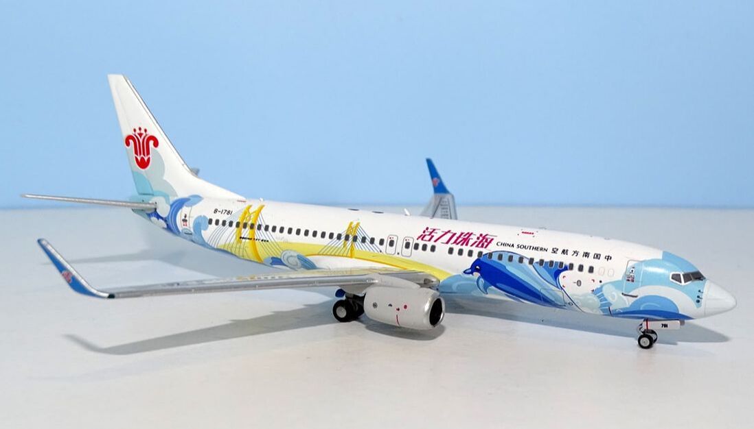
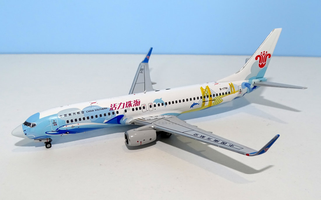
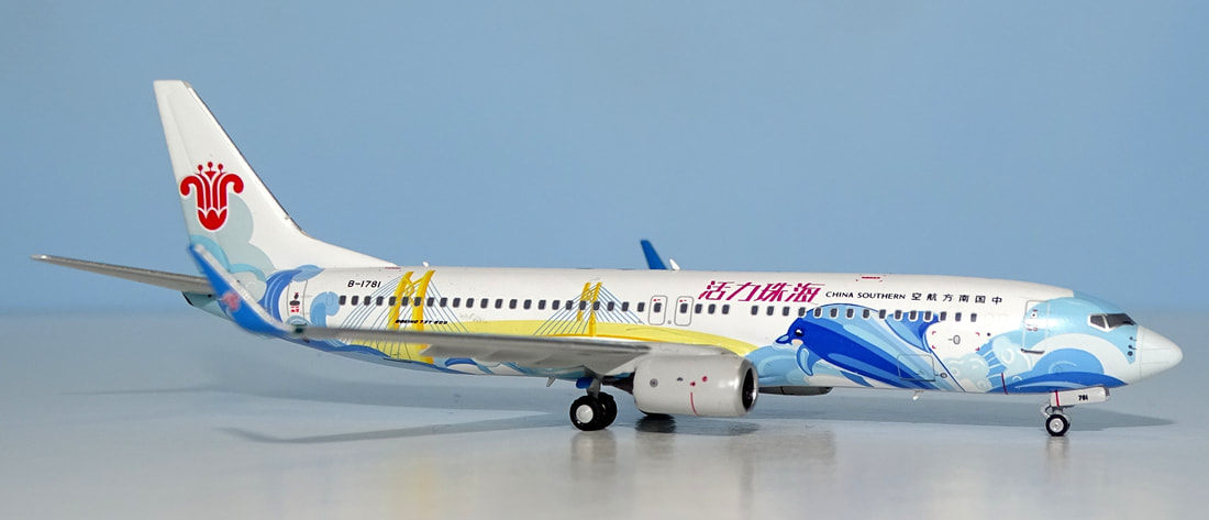
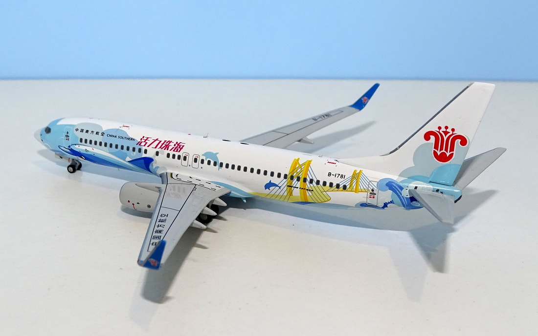
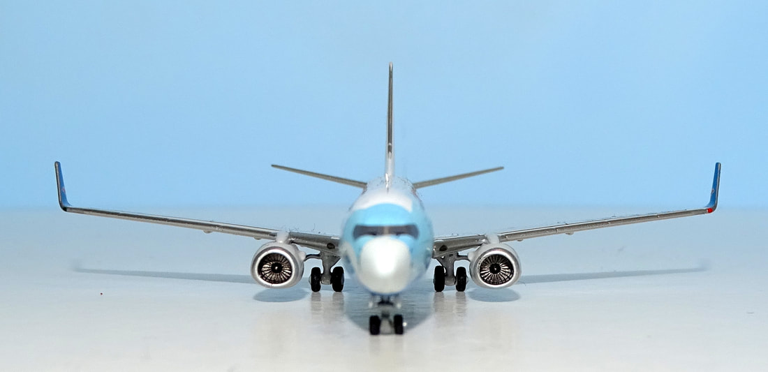
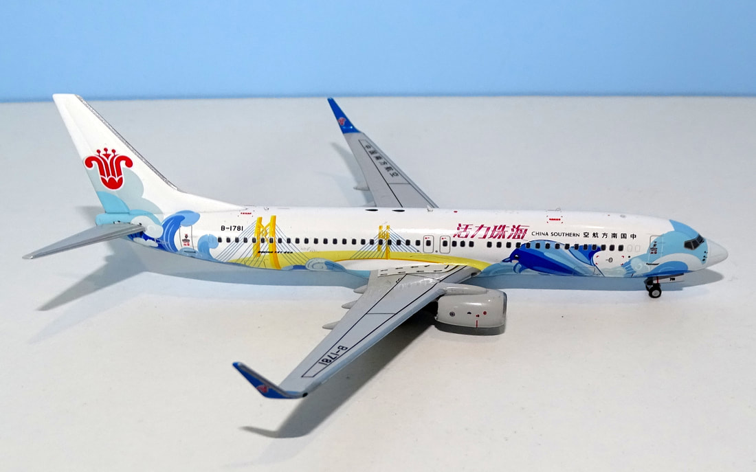
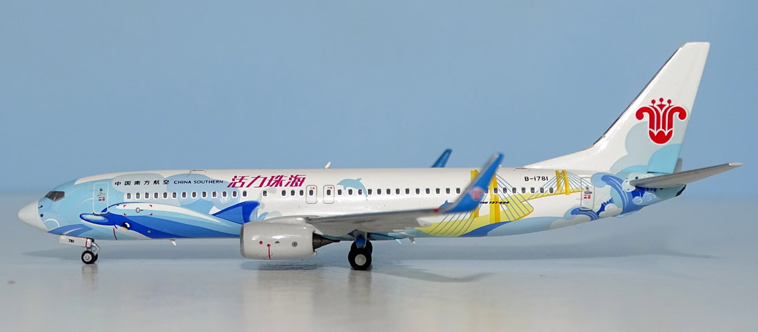
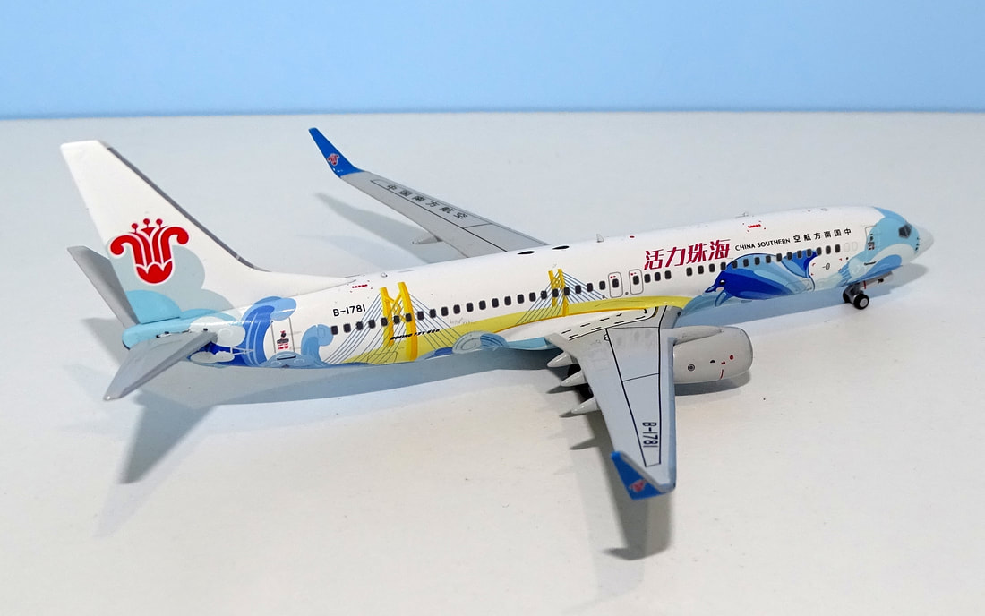
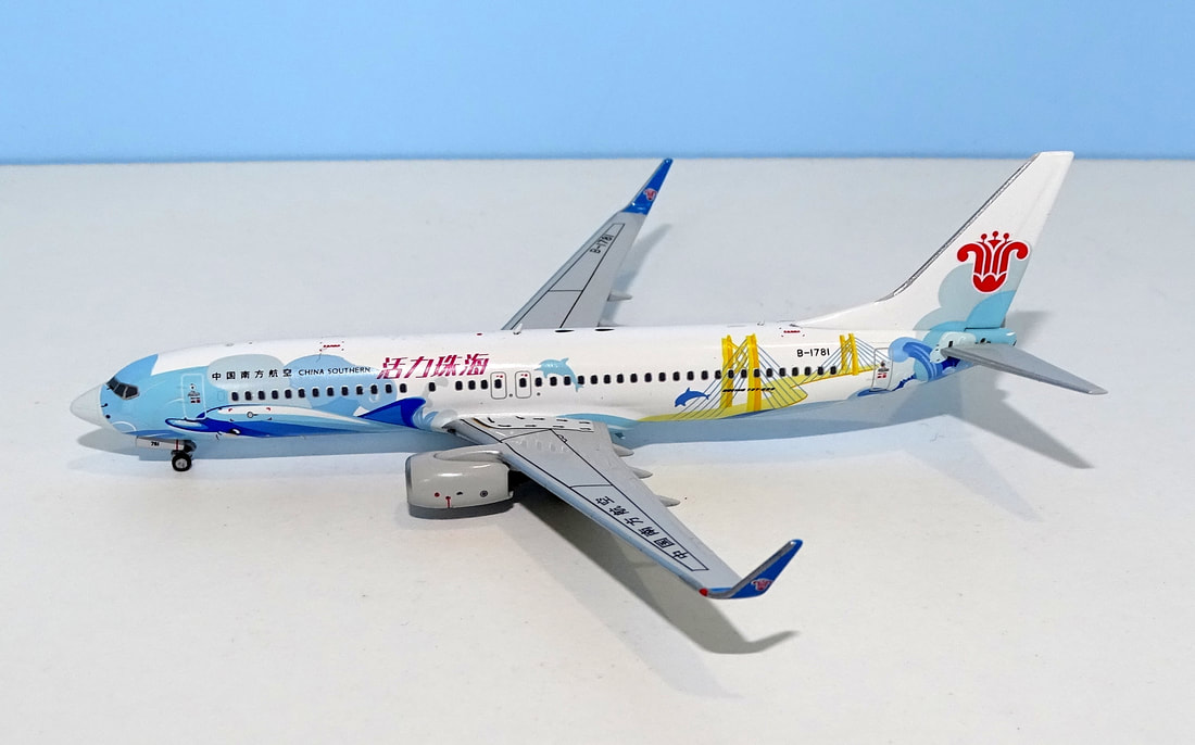
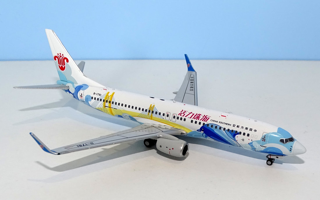
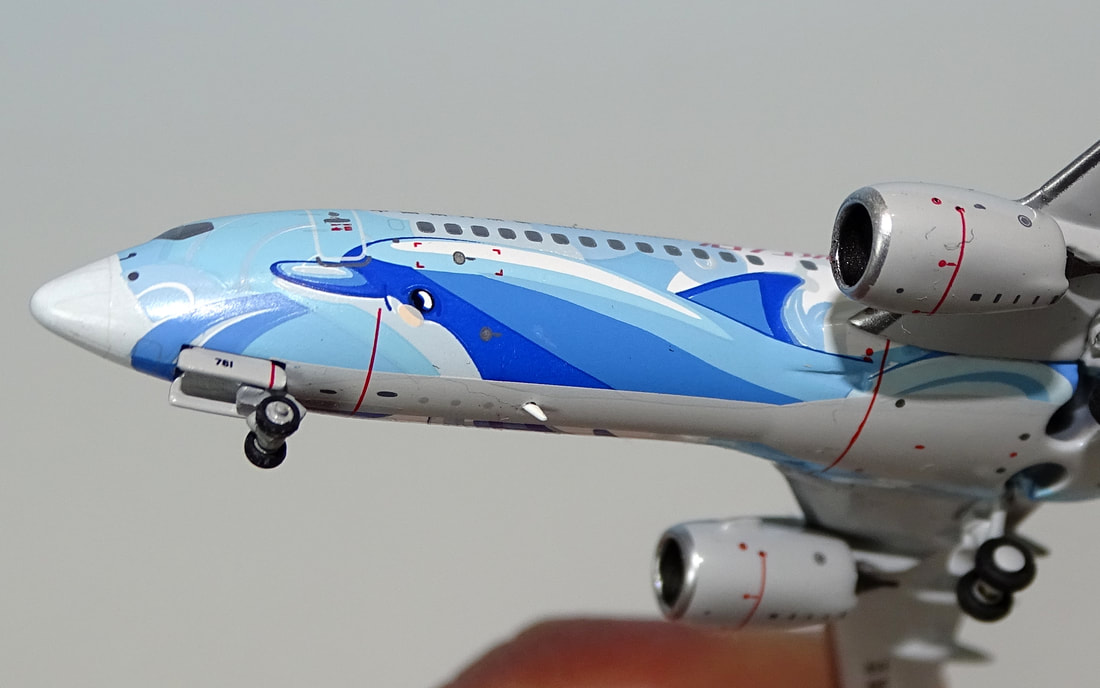
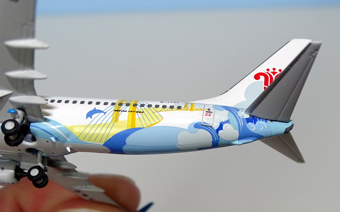
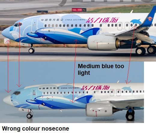
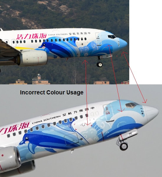
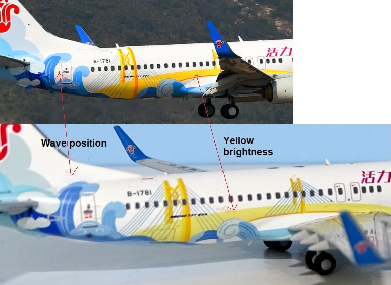
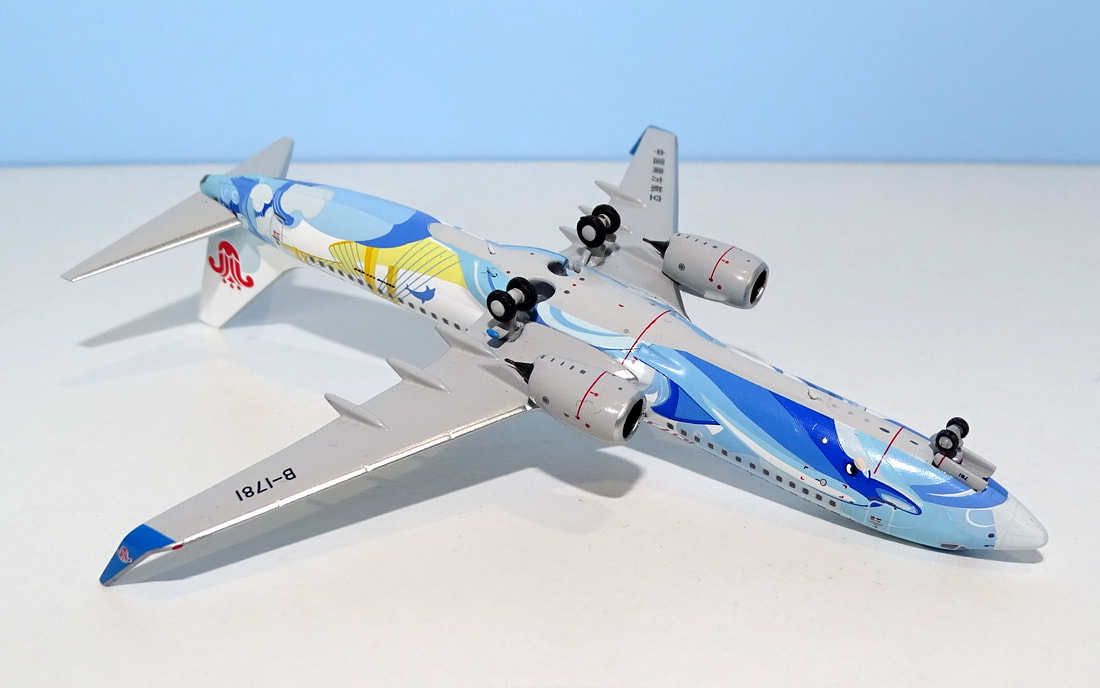
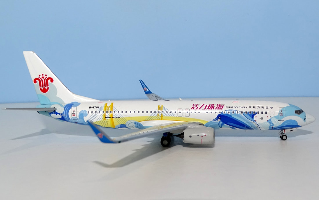
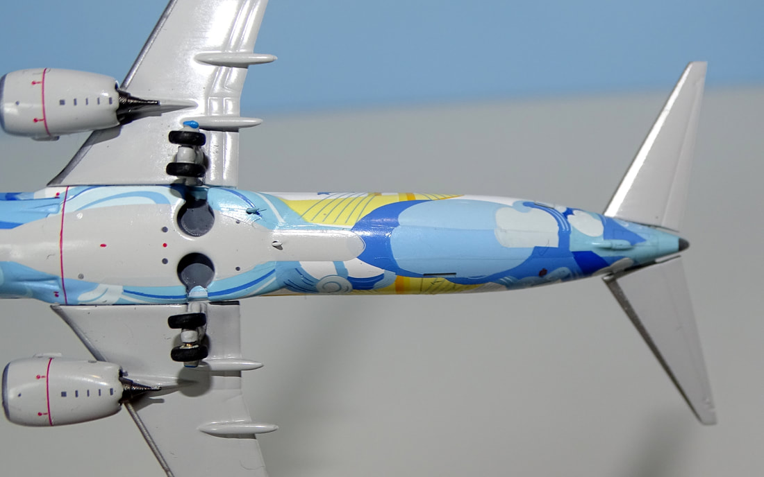
MOULD Prior to the appearance of the NG 737-800 in 2019 the type had been rather poorly represented in 400 scale with a series of relatively weak moulds from Dragon Wings, Gemini Jets, JC Wings, Witty Wings and Phoenix. The best was the 2014 Panda effort. The NG mould changed all that, and, although it is now challenged for supremacy by the new 2020 Panda Models mould, it still for me remains the high watermark for 737s. Not content with already being the best 737-800 NG have modified the nose and undercarriage since they first released it. The NG mould has a beautiful and accurate transition from cockpit to nose perfectly capturing the classic traditional Boeing shape. Even more impressive is the nosegear. The tyre and gear leg are well detailed and proportioned whilst the nosegear doors are a hallmark of attention to detail. Unlike most of the moulds, which have large rectangular slabs, these doors are the right size, angled properly, fit tightly to the fuselage and are not inset into it. They even have rounded upper corners like the real thing. The rest of the fuselage is picture perfect, whilst the wings slot in tightly to the fuselage as they should. The engines and pylons are also impressive. None of the older moulds hold the engines high enough, which means in combination with an often poorly proportioned nose gear that the engines are often too close to the ground. On this mould that is not a problem. The mould also has all five aerials including the pair near each other on the underside, one of which is offset to port. The aerials are all well shaped and sized. Overall this is an effectively perfect 737 and it is no wonder that Panda thought it necessary to replace its old mould with a newer version to compete. The surprise is that neither JC Wings / Gemini Jets or Phoenix have replaced their far weaker offerings to date. SCORE - 10 PAINT & LIVERY Of the Chinese big 3 China Southern has been the most restrained when it comes to special schemes, but that is beginning to change with a greater selection of new liveries appearing. Recently a pair of 737-800s were painted in colours to advertise the city of Zhuhai located opposite Hong Kong, and adjacent to Macau, on the Pearl River Delta in Southern China. B-1781 wears a scheme called "Vitality Zhuhai" and completed its maiden flight on November 21, 2021. The livery represents the "talent-friendly, youth-friendly, environment-friendly, and culturally inclusive development environment of Zhuhai". The aircraft has a fuselage depicting Chinese white dolphins leaping near the Hong Kong-Zhuhai-Macao Bridge (HZMB). It is a very complicated scheme and considering it wraps around the entire fuselage it must be extremely difficult to get right. The livery is also different on each side of the aircraft with the position of the bridge and dolphins changing. It is hard to fault the accuracy of the print detail. The port side placement of images is near perfect but on the starboard side the position of the large wave directly under the vertical stabiliser is very slightly too high. Surprisingly it is the colours where I feel NG has made some mistakes. The scheme has at least five blues. The darkest pair mainly appear on the dolphins and look good. The lightest pair feature prominently on the tail and are also fine, however the intermediate blue is just too light and rather merges into the others. This is most obvious on the port side's leaping dolphin and above the cockpit. Additionally the wrong shade of blue has been used for the nosecone and the some of the waves on the starboard side. They have used the lightest shade when they should have used the middle blue. Lastly once again on the starboard side the yellow of the bridge is rather washed out when it should be bright yellow. I was really interested to understand how well this difficult to make scheme had turned out and the detail of it is wonderful. It has though been let down somewhat by some poor colour matching and most annoyingly the incorrect colour usage at the nosecone. SCORE - 7 PRINTING & QUALITY CONTROL It is clear that when it comes to detailed printing NG Models are at the top of their game. The fineness and detail of the printing here is second to none. Even under magnification there is no let up in the fine line quality and colour application. There is none of the comic book dot style lower quality finishes that can appear on other liveries of this sort of complexity. Under the fuselage the print quality shines also and one of the aerials is even painted the correct shade of blue. There are some minor lines where the different areas of Tampo printing come together but they are hard to spot. From a build quality perspective my only complaint is that the starboard side horizontal stabiliser is loose. SCORE - 9 SUMMARY Attempting this kind of model takes some effort, and I note that although JC Wings have announced it Phoenix have not. The end result here is very nice but not perfect. It does however illustrate the capability that NG possesses while reminding us that although we have come to expect near perfection from them they are human like us all and the odd mistake will creep in. Even so, a score of 26 is certainly no disaster.
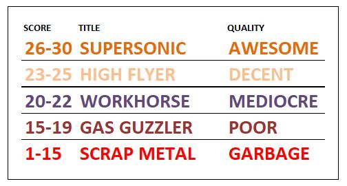
FINAL SCORE - 26/30
0 Comments
Leave a Reply. |
AuthorI'm Richard Stretton an aviation enthusiast and major collector of 400 scale models. On this page I take a detailed look at new releases. This site is free. Please donate to keep it going.
|
- Home
-
My Models
-
AV History
- Airline History Blog
-
Airline Development
>
-
Liveries
>
- Aeroméxico Liveries
- Air China Special Liveries
- American Airlines Liveries
- British Airways Liveries
- Continental Airlines Liveries
- Delta Air Lines Liveries
- Eastern Air Lines Liveries
- Landor Liveries
- National Airlines Liveries
- Northeast Airlines Liveries
- Northwest Airlines Liveries
- Pan Am Liveries
- Trans World Airlines Liveries
- United Airlines Liveries
- Western Airlines Liveries
- Airbus A380s >
- Boeing 747 >
- Real Airport Histories >
- Plane Spotting >
- Aviation Stickers >
-
1:400 SCALE
- Collecting 1:400 Scale >
- The History of 1:400 Scale >
-
1:400 Brands
>
- Aeroclassics >
- Airshop Diecast
- AURORA Models
- Aviation400 (2007-2012)
- Big Bird 400 Your Craftsman
- Black Box Models
- Blue Box & Magic Models
- C Models
- Dragon Wings
- El Aviador 400
- Gemini Jets >
- JAL Collection / Jet Hut >
- Jet-X >
- MP4 Models
- NG Models >
- Panda Models >
- Phoenix Models >
- Seattle Models Co (SMA)
- Skyjets400
- Sovereign Models
- TucanoLine
- Witty Wings / Apollo
- Yu ModeLs
- 1:400 Custom Models >
- Production Numbers
- Zinc Rot
-
1:400 Moulds
- The Best Moulds >
- Airbus >
-
Boeing
>
- Boeing B-377 Stratocruiser
- Short Boeing 707s & 720s
- Boeing 707-320/420
- Boeing 717
- Boeing 727-100
- Boeing 727-200
- Boeing 737-100/200
- Boeing 737-300 >
- Boeing 737-400
- Boeing 737-500
- Boeing 737-600
- Boeing 737-700/800/900 >
- Boeing 737 MAX
- Boeing 747-100/200 >
- Boeing 747-400 >
- Boeing 747SP
- Boeing 747-8 Interactive
- Boeing 747LCF Dreamlifter
- Boeing 757-200 >
- Boeing 757-300
- Boeing 767-200
- Boeing 767-300
- Boeing 777-200
- Boeing 777-300
- Boeing 787
- British >
- Douglas >
- Lockheed >
- Other >
- Chinese >
- Soviet >
- Smallest Moulds in 1:400
-
1:400 Reviews
-
Model News
- Model Blog
-
New Mould Samples
>
- Aviation400 >
- JC Wings >
-
NG Models 400 Scale
>
- Airbus A318
- Airbus A319/320 CEO
- Airbus A319/320 NEO
- Airbus A321CEO & NEO
- Airbus A330-200/300
- Airbus A330 Beluga XL
- Airbus A330-800/900
- Airbus A340-200/300
- Airbus A350-900
- Airbus A350-1000
- Boeing 737-600/700/900
- Boeing 737-600 Refresh
- Boeing 737-800
- Boeing 737 MAX-8/MAX-9
- Boeing 737 MAX-7/MAX-10
- Boeing 747-100
- Boeing 747-200
- Boeing 747-400
- Boeing B747SP
- Boeing 747-8I
- Boeing 747-8F
- NG 747s Together
- Boeing 757-300
- Boeing 767-200/300 >
- Boeing 767-400 >
- Boeing 777-200
- Boeing 777-300/300ER
- Boeing 787-8
- Lockheed L-1011 Tristar
- Lockeed Tristar 500
- McDonnell Douglas MD-80
- McDonnell Douglas MD-87
- Tupolev Tu-154
- Tupolev Tu-204/Tu-214/Tu-234
- NG Models 200 Scale >
- Phoenix Models >
- Yu ModeL >
-
1:600 SCALE
- DIORAMAS
 RSS Feed