- Home
-
My Models
-
AV History
- Airline History Blog
-
Airline Development
>
-
Liveries
>
- Aeroméxico Liveries
- Air China Special Liveries
- American Airlines Liveries
- British Airways Liveries
- Continental Airlines Liveries
- Delta Air Lines Liveries
- Eastern Air Lines Liveries
- Landor Liveries
- National Airlines Liveries
- Northeast Airlines Liveries
- Northwest Airlines Liveries
- Pan Am Liveries
- Trans World Airlines Liveries
- United Airlines Liveries
- Western Airlines Liveries
- Airbus A380s >
- Boeing 747 >
- Real Airport Histories >
- Plane Spotting >
- Aviation Stickers >
-
1:400 SCALE
- Collecting 1:400 Scale >
- The History of 1:400 Scale >
-
1:400 Brands
>
- Aeroclassics >
- Airshop Diecast
- AURORA Models
- Aviation400 (2007-2012)
- Big Bird 400 Your Craftsman
- Black Box Models
- Blue Box & Magic Models
- C Models
- Dragon Wings
- El Aviador 400
- Gemini Jets >
- JAL Collection / Jet Hut >
- Jet-X >
- MP4 Models
- NG Models >
- Panda Models >
- Phoenix Models >
- Seattle Models Co (SMA)
- Skyjets400
- Sovereign Models
- TucanoLine
- Witty Wings / Apollo
- Yu ModeLs
- 1:400 Custom Models >
- Production Numbers
- Zinc Rot
-
1:400 Moulds
- The Best Moulds >
- Airbus >
-
Boeing
>
- Boeing B-377 Stratocruiser
- Short Boeing 707s & 720s
- Boeing 707-320/420
- Boeing 717
- Boeing 727-100
- Boeing 727-200
- Boeing 737-100/200
- Boeing 737-300 >
- Boeing 737-400
- Boeing 737-500
- Boeing 737-600
- Boeing 737-700/800/900 >
- Boeing 737 MAX
- Boeing 747-100/200 >
- Boeing 747-400 >
- Boeing 747SP
- Boeing 747-8 Interactive
- Boeing 747LCF Dreamlifter
- Boeing 757-200 >
- Boeing 757-300
- Boeing 767-200
- Boeing 767-300
- Boeing 777-200
- Boeing 777-300
- Boeing 787
- British >
- Douglas >
- Lockheed >
- Other >
- Chinese >
- Soviet >
- Smallest Moulds in 1:400
-
1:400 Reviews
-
Model News
- Model Blog
-
New Mould Samples
>
- Aviation400 >
- JC Wings >
-
NG Models 400 Scale
>
- Airbus A318
- Airbus A319/320 CEO
- Airbus A319/320 NEO
- Airbus A321CEO & NEO
- Airbus A330-200/300
- Airbus A330 Beluga XL
- Airbus A330-800/900
- Airbus A340-200/300
- Airbus A350-900
- Airbus A350-1000
- Boeing 737-600/700/900
- Boeing 737-600 Refresh
- Boeing 737-800
- Boeing 737 MAX-8/MAX-9
- Boeing 737 MAX-7/MAX-10
- Boeing 747-100
- Boeing 747-200
- Boeing 747-400
- Boeing B747SP
- Boeing 747-8I
- Boeing 747-8F
- NG 747s Together
- Boeing 757-300
- Boeing 767-200/300 >
- Boeing 767-400 >
- Boeing 777-200
- Boeing 777-300/300ER
- Boeing 787-8
- Lockheed L-1011 Tristar
- Lockeed Tristar 500
- McDonnell Douglas MD-80
- McDonnell Douglas MD-87
- Tupolev Tu-154
- Tupolev Tu-204/Tu-214/Tu-234
- NG Models 200 Scale >
- Phoenix Models >
- Yu ModeL >
-
1:600 SCALE
- DIORAMAS
|
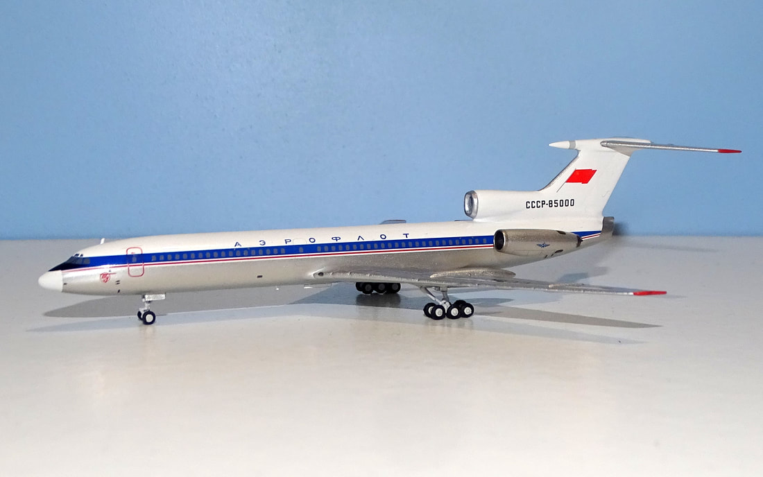
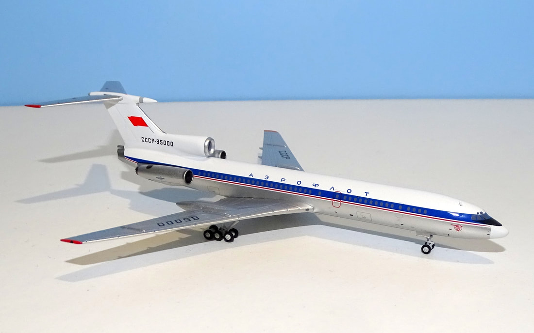
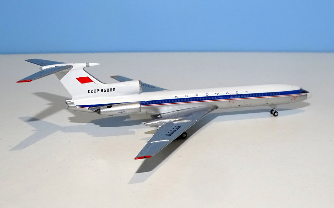
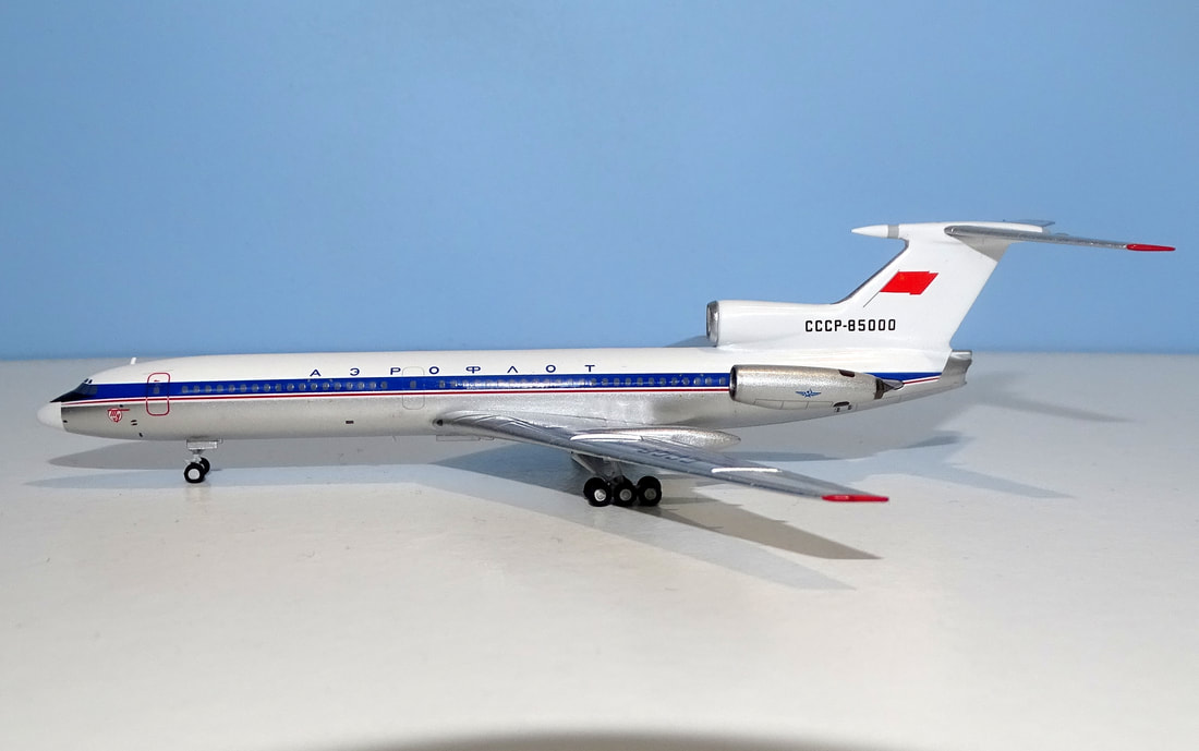
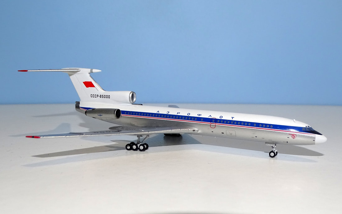
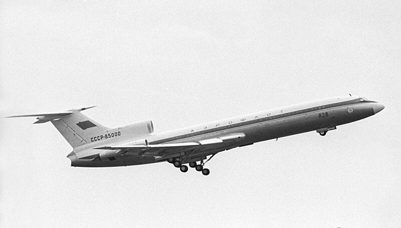
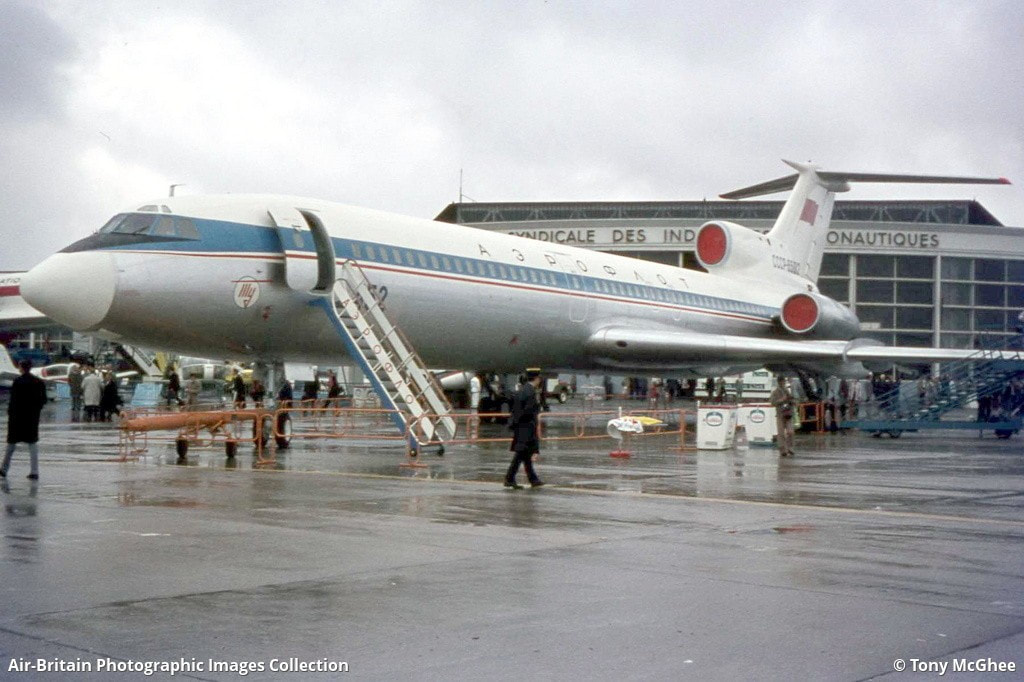
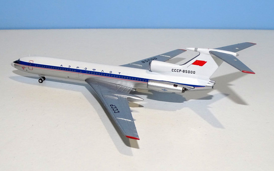
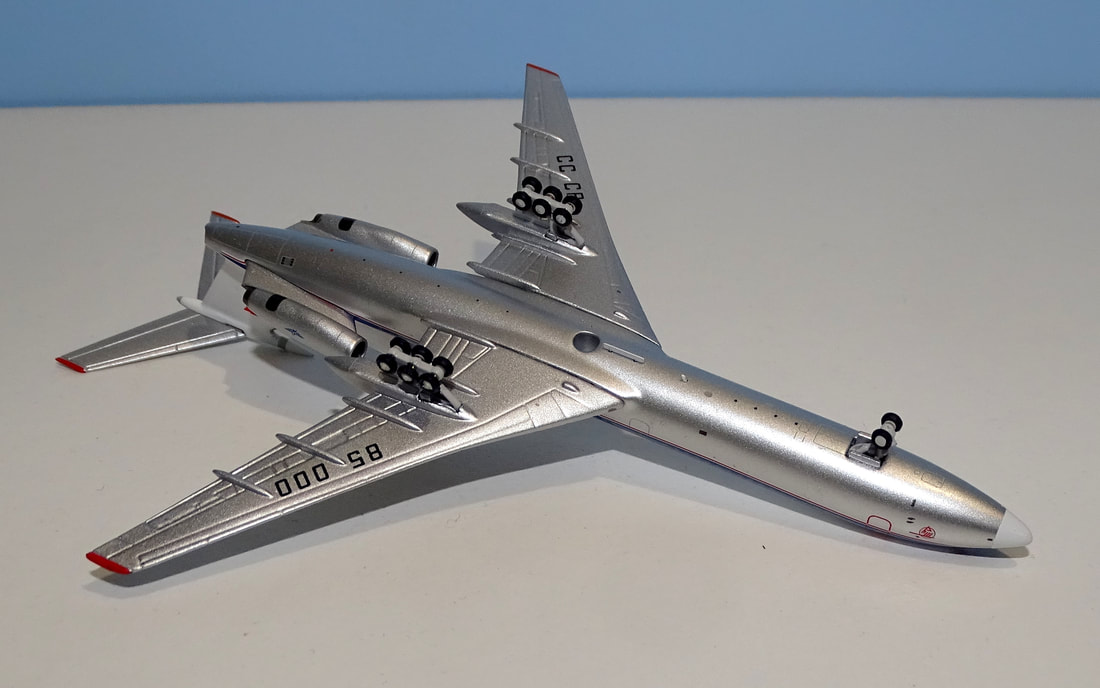
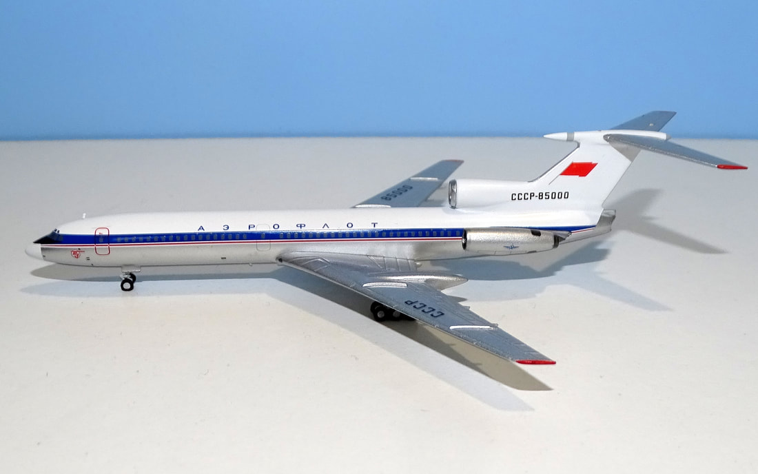
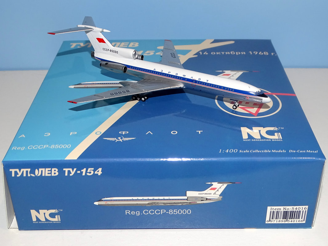
I've been rather critical of NG Models' usage of their Tu-154 moulds and in over a year this is only the tenth they've made (4 Tu-154Bs, 5 Tu-154Ms and now this Tu-154 'sans suffixe') in well over a year. When NG have made over 310 models in 2023 alone that isn't a great return. Even then 3 out of the 10 have been military versions. This release is something of an oddity too since it represents the prototype Tu-154 that NG technically don't actually have a mould for. It was also made by Aeroclassics in 2021 so there's that as well. I own both versions so let's take a closer look at the newest. Each review is to split into three key areas:
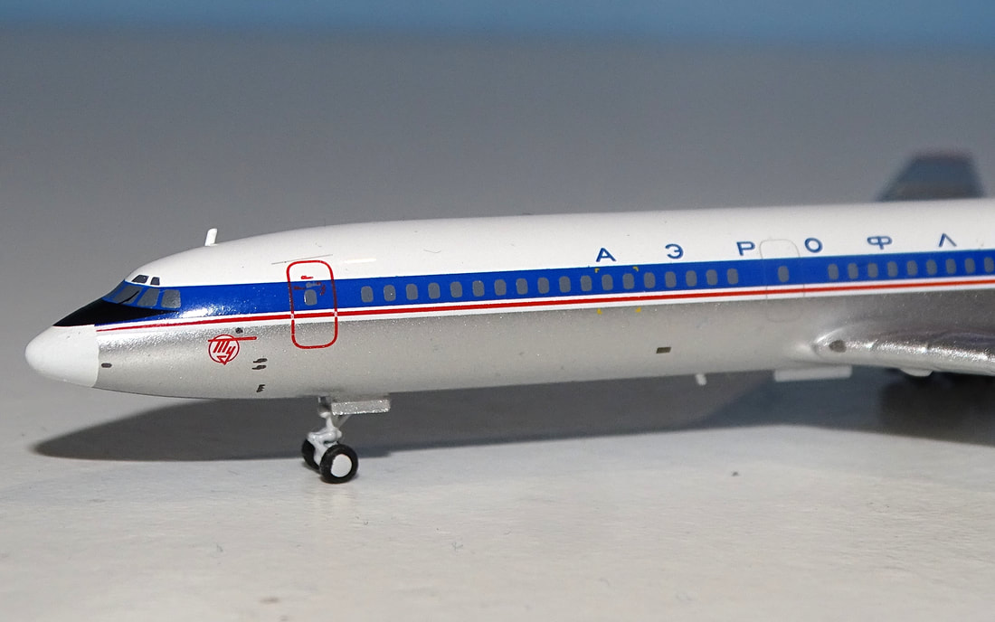
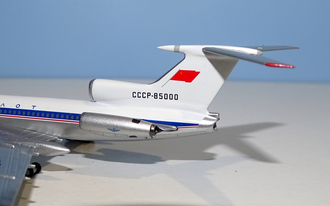
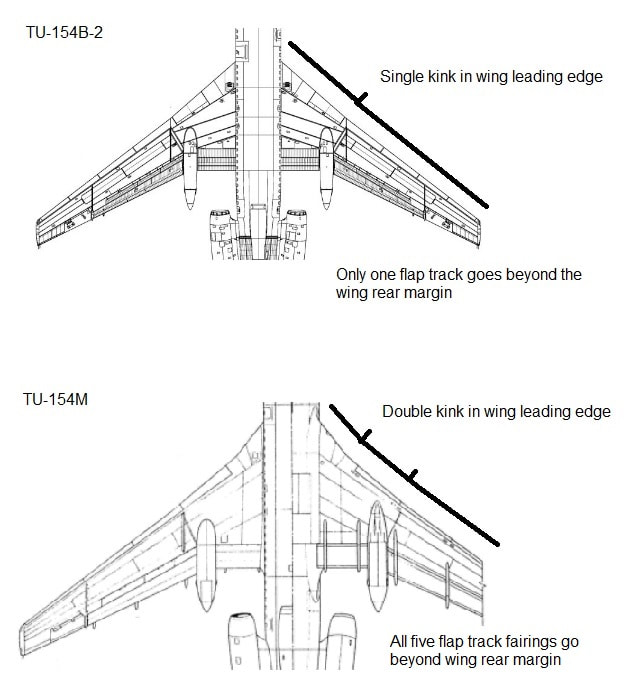
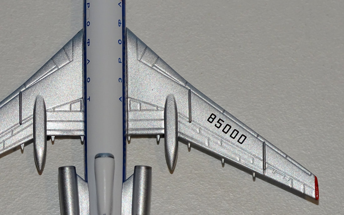
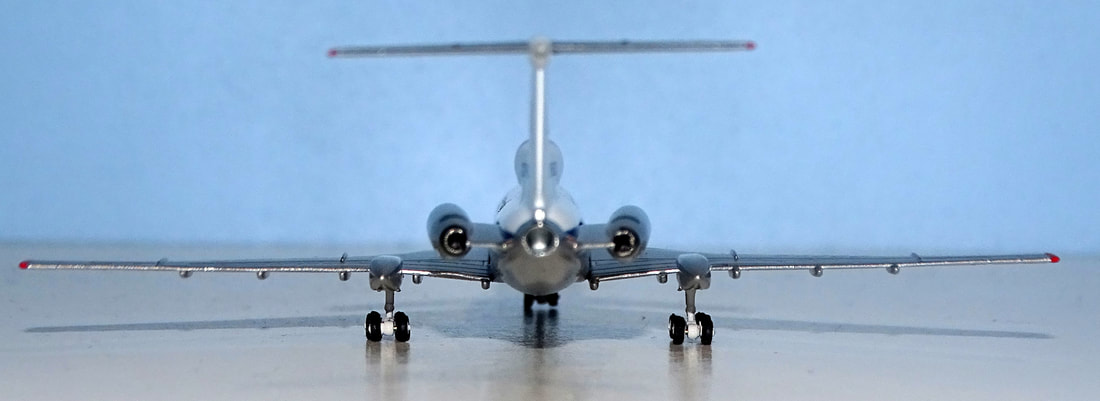
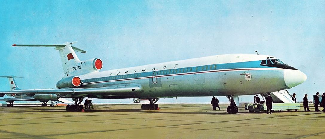
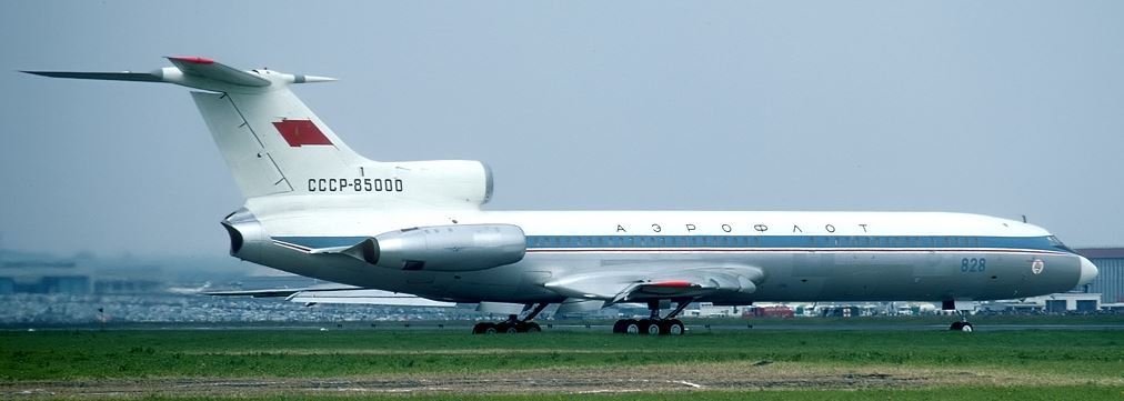
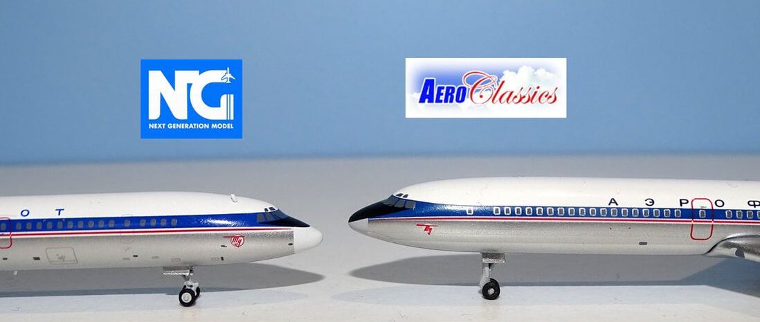
MOULD The first NG Models Tu-154 debuted finally in September 2022 after I'd reviewed the samples in April. However, initially it was only the Tu-154M that was used as several issues were identified with the B version mould samples. For more details on the mould samples see here: The first Tu-154B was announced in June 2023 and since then has been used more regularly than the Tu-154M. The big differences between the two variants are in three key areas: wing form, side-mounted engines and the central no 2 engine intake and exhaust. From the front this mould shares the excellence of the Tu-154M version. The entire forward region ahead of the wing is beautiful and spot-on. The addition of the small off-set to starboard aerial behind the cockpit is a lovely touch. The nosegear is exemplary too. Initially this prototype aircraft had a different nosegear with the gear door in front of the landing gear leg, but it appears that by 1969 it had been fitted with the standard gear leg as seen here. The maingear is very fine and well sized. It connects to the large underwing gear pods and unlike some of the earlier releases now has the tiny maingear doors fitted. Towards the rear and the original non-M number 2 engine intake, hump and exhaust all mould beautifully into the vertical stabiliser. The exhaust has the distinctive concave no 2 outlet pipe with the APU outlet fixed above it. The older Kuznetsov engines, without the clamsheel thrust reversers of the 154M's Solovievs top off an excellent Tu-154B rear. Of course however this model is of a Tu-154 'sans suffixe' (the original version with no A or B) not a B so the HF radio tail spike should be a different shape. It ought to be a lot slenderer, more needle like. I understand that making this change for one model is not very cost effective but it would have been nice to see. When talking about the B from the M it is of course the wing structure that is another major difference. NG have modified the wing leading edge so that it has the correct single kink of a B but they have forgotten to modify the flap track fairings, which still resemble an M. The wing is therefore an odd hybrid between a B and M version. As with all NG Tu-154s it is also worth mentioning that the wing on this model doesn't show enough anhedral and appears too level. Ignoring the wing's issues for a B, this being a Tu-154 'sans suffixe' it technically should have a very different wing anyway. The original, and disastrous, Tu-154 wing had different flap and slat structures, plus, more obviously, two large boundary layer fences that wrapped around the wing leading edge. Ultimately an entirely new wing was designed after the original wing design showed an incredibly short fatigue life. That was used on the later B and M variants (and this model). As a full-on Tu-154B version this model has a couple of issues (wingtip height and flap track form) that would probably get it an 8 or maybe even a 9. If I'm scoring it as a real Tu-154 'sans suffixe' then the problems are larger - HF tail spike and wing form in general are additional issues. I can understand why NG didn't go the whole hog to make a full-on 'sans suffixe' version, Aeroclassics didn't either, but ultimately this is a chimera mould when used for this aircraft. SCORE - 7 PAINT & LIVERY The prototype Tu-154 CCCP-85000 first flew on October 3, 1968 and was painted into its own scheme, quite similar to the later standard livery but with a much lighter cheatline, more spread out titles and a wavy flag on the tail complete with flagpole. This was of course prior to the standardisation of the Aeroflot scheme in 1973. I've seen several people question whether the blue on this model was too light, using the NG reference photos as the guide. Black and white photos make the cheatline look dark but the few colour photos available clearly show that the cheatline should be a lighter blue and actually the model in hand matches the Aeroclassics release. Both are ironically a little too dark. Another area where both versions match but are incorrect are the fuselage titles where both show a font which is rather squashed vertically. Additionally the NG version here has blue titles when all the photos I see suggest they should be black. On the plus side the NG Models version has a much better painted and accurate nose area. The anti-glare under the cockpit is correctly smaller and the nosecone correctly white. The print detailing on the Tupolev logo is also a lot finer and more intricate. I can't fault the tail logo and NG have added the grey ring around the HF aerial spike on the tail, which is missing on the Aeroclassics version. SCORE - 8 PRINTING & QUALITY CONTROL Printwork is an area where in general NG are strong and the fineness and level of printwork here easily surpasses the Aeroclassics version. This is especially evident underneath where the Aeroclassics is almost devoid of print but this version has lots of fine detailing. NG also get basics like the door configuration correct as well. On the Aeroclassics version the model is lacking entirely the L1 door and the door just ahead of the wing is too heavily outlined. There are no QC issues I can see. SCORE - 10 SUMMARY Historically it is not unusual for manufacturers to cut corners when releasing a one-off aircraft that would otherwise be financially unviable to produce if the mould was modified to be 100% accurate. NG haven't taken this approach before but given they've struggled with the difference between a B and an M version Tu-154, and there are no other liveries to make with a 'sans suffixe', I can understand the approach here. The model looks great but technically it is a 'fantasy' version, much like the Aeroclassics version, which it outcompetes due to the quality of the base 154 mould and the much better printing quality and accuracy, especially at the nose.
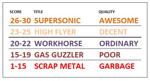
SCORE - 25/30
3 Comments
Pavel
5/12/2023 02:48:29 pm
I am grateful to manufacturers like NG, who have increased the accuracy of models to a new level and are constantly intensively developing new projects. But speaking of inaccuracies, the following can be noted.
Reply
Carl
5/12/2023 05:41:06 pm
The anhedral on the wing is what gives the TU-154 its unique character, a shame that this isn't reproduced accurately enough here.
Reply
Adrian
26/12/2023 11:17:19 pm
Alas , cheatline blue completely the wrong shade as arer the titles which should be black. These are deal killers for me!
Reply
Leave a Reply. |
AuthorI'm Richard Stretton an aviation enthusiast and major collector of 400 scale models. On this page I take a detailed look at new releases. This site is free. Please donate to keep it going.
|
- Home
-
My Models
-
AV History
- Airline History Blog
-
Airline Development
>
-
Liveries
>
- Aeroméxico Liveries
- Air China Special Liveries
- American Airlines Liveries
- British Airways Liveries
- Continental Airlines Liveries
- Delta Air Lines Liveries
- Eastern Air Lines Liveries
- Landor Liveries
- National Airlines Liveries
- Northeast Airlines Liveries
- Northwest Airlines Liveries
- Pan Am Liveries
- Trans World Airlines Liveries
- United Airlines Liveries
- Western Airlines Liveries
- Airbus A380s >
- Boeing 747 >
- Real Airport Histories >
- Plane Spotting >
- Aviation Stickers >
-
1:400 SCALE
- Collecting 1:400 Scale >
- The History of 1:400 Scale >
-
1:400 Brands
>
- Aeroclassics >
- Airshop Diecast
- AURORA Models
- Aviation400 (2007-2012)
- Big Bird 400 Your Craftsman
- Black Box Models
- Blue Box & Magic Models
- C Models
- Dragon Wings
- El Aviador 400
- Gemini Jets >
- JAL Collection / Jet Hut >
- Jet-X >
- MP4 Models
- NG Models >
- Panda Models >
- Phoenix Models >
- Seattle Models Co (SMA)
- Skyjets400
- Sovereign Models
- TucanoLine
- Witty Wings / Apollo
- Yu ModeLs
- 1:400 Custom Models >
- Production Numbers
- Zinc Rot
-
1:400 Moulds
- The Best Moulds >
- Airbus >
-
Boeing
>
- Boeing B-377 Stratocruiser
- Short Boeing 707s & 720s
- Boeing 707-320/420
- Boeing 717
- Boeing 727-100
- Boeing 727-200
- Boeing 737-100/200
- Boeing 737-300 >
- Boeing 737-400
- Boeing 737-500
- Boeing 737-600
- Boeing 737-700/800/900 >
- Boeing 737 MAX
- Boeing 747-100/200 >
- Boeing 747-400 >
- Boeing 747SP
- Boeing 747-8 Interactive
- Boeing 747LCF Dreamlifter
- Boeing 757-200 >
- Boeing 757-300
- Boeing 767-200
- Boeing 767-300
- Boeing 777-200
- Boeing 777-300
- Boeing 787
- British >
- Douglas >
- Lockheed >
- Other >
- Chinese >
- Soviet >
- Smallest Moulds in 1:400
-
1:400 Reviews
-
Model News
- Model Blog
-
New Mould Samples
>
- Aviation400 >
- JC Wings >
-
NG Models 400 Scale
>
- Airbus A318
- Airbus A319/320 CEO
- Airbus A319/320 NEO
- Airbus A321CEO & NEO
- Airbus A330-200/300
- Airbus A330 Beluga XL
- Airbus A330-800/900
- Airbus A340-200/300
- Airbus A350-900
- Airbus A350-1000
- Boeing 737-600/700/900
- Boeing 737-600 Refresh
- Boeing 737-800
- Boeing 737 MAX-8/MAX-9
- Boeing 737 MAX-7/MAX-10
- Boeing 747-100
- Boeing 747-200
- Boeing 747-400
- Boeing B747SP
- Boeing 747-8I
- Boeing 747-8F
- NG 747s Together
- Boeing 757-300
- Boeing 767-200/300 >
- Boeing 767-400 >
- Boeing 777-200
- Boeing 777-300/300ER
- Boeing 787-8
- Lockheed L-1011 Tristar
- Lockeed Tristar 500
- McDonnell Douglas MD-80
- McDonnell Douglas MD-87
- Tupolev Tu-154
- Tupolev Tu-204/Tu-214/Tu-234
- NG Models 200 Scale >
- Phoenix Models >
- Yu ModeL >
-
1:600 SCALE
- DIORAMAS

 RSS Feed